
Understanding Technical Analysis: Charting Your Path to Informed Trading
Welcome to a deeper dive into the world of investing. As you navigate the dynamic landscape of financial markets, you’ll encounter various approaches to making decisions. One powerful method, embraced by traders and investors worldwide, is technical analysis. It’s a discipline focused on evaluating securities by analyzing the statistics generated by market activity, such as past prices and volume. Think of it as reading the market’s autobiography, trying to understand its past behavior to anticipate its future actions.
Unlike fundamental analysis, which scrutinizes a company’s intrinsic value by examining financial statements, industry trends, and economic indicators, technical analysis looks solely at price and volume data. It operates on the premise that all known information about a security is already reflected in its price. By studying price charts and applying various analytical tools, we aim to identify patterns, trends, and potential turning points. Why do investors and traders use technical analysis? For many, it provides a framework for timing market entry and exit points, managing risk, and making objective decisions based on concrete market data, rather than subjective opinions or news flow.
Are you ready to learn this language of the charts? We will explore its core tenets, the tools it employs, and how you can integrate it into your investment process. It’s not magic, but a skill that, with practice, can significantly enhance your market understanding.
Here are three key benefits of technical analysis:
- Helps identify entry and exit points.
- Allows for risk management through established levels of support and resistance.
- Provides a way to objectively assess market sentiment using visual data.

The Foundational Pillars: Core Principles of Technical Analysis
Technical analysis rests on several key assumptions that form its theoretical bedrock. Understanding these principles is crucial before we delve into specific tools or techniques. They are the lens through which all technical analysts view the market.
First, and perhaps most fundamentally, is the belief that market action discounts everything. This principle suggests that at any given time, a security’s price reflects all relevant information: economic factors, fundamental performance, market sentiment, geopolitical events, and even the collective psychology of all market participants. Technical analysts don’t need to know *why* the price is moving; they assume that the price itself is the ultimate manifestation of the battle between supply and demand, incorporating every known factor. This allows technicians to focus purely on price movements and patterns.
The second core principle is that prices move in trends. This is central to trend-following strategies, a significant component of technical analysis. Once a trend is established – be it upward, downward, or sideways – it is assumed to continue in that direction until a signal indicates its reversal. Identifying these trends early and riding them for as long as they persist is a primary goal. Trends can exist on different timeframes: minute-by-minute, hourly, daily, weekly, or even monthly. A stock might be in a long-term uptrend but experiencing a short-term downtrend. Technical analysis provides tools to identify, confirm, and follow these trends across various scales.
Third, and intrinsically linked to the first two, is the idea that history repeats itself. This principle is rooted in market psychology. Human emotions like fear, greed, hope, and panic tend to manifest in consistent ways over time. When these collective emotions interact with market dynamics, they often create recurring price patterns on charts. Technical analysts study these historical patterns – such as head and shoulders, double tops/bottoms, flags, and pennants – believing that similar formations in the future are likely to have similar outcomes. It’s not that the market is identical to the past, but that the psychological forces driving market participants create predictable responses captured in price action.
These three principles provide a robust, albeit simplified, view of market behavior. They allow technicians to abstract away the countless variables of fundamental analysis and focus on the observable results: price and volume. While critics argue these assumptions oversimplify complexity, proponents find they offer a practical and actionable framework for making trading decisions.
Here is a table summarizing the three core principles of technical analysis:
| Core Principle | Description |
|---|---|
| Market Action Discounts Everything | All known information is reflected in price. |
| Prices Move in Trends | Trends persist until reversed by opposing signals. |
| History Repeats Itself | Market psychology leads to recurring price patterns. |

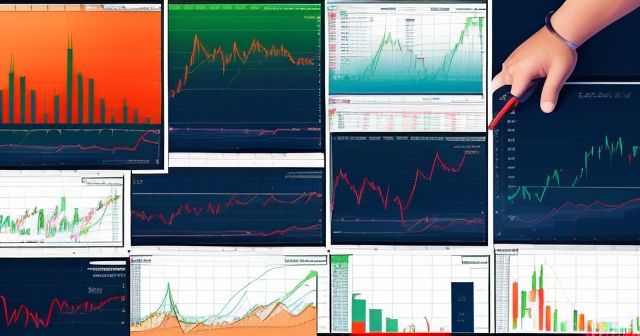
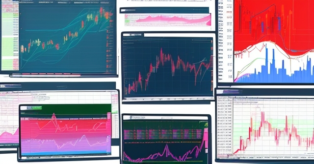
Decoding the Charts: Reading the Language of Price
The primary canvas for technical analysis is the price chart. Before we can interpret patterns or apply indicators, we must understand how prices are visually represented. Various chart types exist, each offering a unique perspective on market activity within a given timeframe.
The simplest is the line chart. This chart type connects a series of data points, usually the closing prices over a specific period. It provides a clear, uncluttered view of the trend, focusing solely on the overall direction. While useful for spotting long-term trends, it lacks detail about the price movements within each period.
A step up in detail is the bar chart. For each period (e.g., a day), a vertical bar is drawn. The top of the bar represents the highest price reached during the period, and the bottom represents the lowest price. A horizontal tick on the left side of the bar indicates the opening price, while a tick on the right indicates the closing price. This gives us the “OHLC” data (Open, High, Low, Close) for each period, offering more insight into volatility and price range than a line chart.
However, perhaps the most popular and visually informative chart type today is the candlestick chart. Originating in 17th-century Japan, candlestick charts provide the same OHLC information as bar charts but in a more intuitive graphical format. Each period is represented by a “candlestick” with a “body” and “wicks” or “shadows”.
The body of the candlestick represents the range between the opening and closing prices. If the closing price is higher than the opening price, the body is typically colored green or white (a bullish candle). If the closing price is lower than the opening price, the body is colored red or black (a bearish candle). The length of the body indicates the magnitude of the price change during the period.
The wicks (or shadows) extend above and below the body. The upper wick represents the highest price reached during the period, and the lower wick represents the lowest price. Long wicks suggest significant price movement beyond the open/close range, indicating volatility or price rejection. Short wicks suggest most of the price action stayed within the open/close range.
Why are candlesticks so popular? Their visual nature makes it easy to quickly grasp the sentiment of a period – bullish or bearish, high volatility or low, potential reversals indicated by specific shapes like Dojis or Hammers. Learning to read candlestick patterns is often the first step in applying technical analysis, as individual candles and combinations of a few candles can signal potential shifts in market sentiment.
Support and Resistance: The Unseen Barriers
Imagine price action as a ball bouncing up and down. Support and resistance levels are like the floor and ceiling it encounters. These are key price levels where buying or selling pressure is expected to be strong enough to potentially halt or reverse a trend.
A support level is a price point where demand is thought to be strong enough to prevent the price from falling further. As the price declines towards a support level, buyers tend to become more interested, anticipating a bounce. Sellers, who might have been driving the price down, may become hesitant to sell below this perceived value area. It’s a zone where historical data suggests purchasing power tends to outweigh selling pressure.
Conversely, a resistance level is a price point where selling pressure is expected to overcome buying pressure, potentially stopping or reversing an upward trend. As the price rises towards a resistance level, sellers tend to become more active, looking to take profits or short the security, while buyers may become reluctant to purchase at these elevated levels. It’s a zone where historical data suggests selling pressure tends to overwhelm purchasing power.
Support and resistance levels can be identified in various ways. They are often found at previous swing highs and swing lows – points where the price historically reversed direction. Horizontal lines connecting these significant turning points can act as powerful static support or resistance zones. Round numbers (like $100, $500) can also act as psychological support or resistance due to collective market sentiment.
However, these levels are not always static. They can also be dynamic, constantly changing with the price. Examples include moving averages or trend lines, which we will discuss later. A declining trend line acts as dynamic resistance, while a rising trend line acts as dynamic support.
What happens when a support or resistance level is broken? This is often a significant event. A decisive break above resistance can signal that the bulls have overcome the selling pressure at that level, potentially paving the way for further upward movement. Interestingly, once resistance is broken, it often turns into new support. Similarly, a break below support suggests the bears are now in control, potentially leading to further declines. Broken support often becomes new resistance.
Identifying support and resistance is fundamental because it helps define potential entry points (near support in an uptrend, or after resistance breaks), exit points (near resistance in an uptrend, or after support breaks), and stop-loss placement (just below support for a long position, just above resistance for a short position). They represent key battlegrounds between buyers and sellers.

Identifying the Market’s Compass: Trend Analysis
As we discussed, prices move in trends. Trend analysis is the process of identifying the direction and strength of these trends to trade in harmony with the prevailing market flow. Trying to trade against a strong trend is often likened to trying to swim against a powerful current – it requires significant effort and is often unsuccessful.
There are three main types of trends:
- Uptrend (Bullish Trend): Characterized by a series of successively higher highs and higher lows. The price is generally moving upwards over time.
- Downtrend (Bearish Trend): Defined by a series of successively lower highs and lower lows. The price is generally moving downwards over time.
- Sideways Trend (Trading Range or Horizontal Trend): Occurs when the price trades within a relatively defined range, without making significant higher highs/lows or lower highs/lows. This represents a period of consolidation or indecision before a potential breakout.
How do we identify trends visually? One of the most common methods is drawing trend lines. In an uptrend, you can draw a line connecting two or more successive higher lows. This rising line acts as dynamic support. As long as the price remains above this trend line, the uptrend is considered intact. In a downtrend, you draw a line connecting two or more successive lower highs. This falling line acts as dynamic resistance. As long as the price stays below this trend line, the downtrend is likely to continue.
Trend lines are considered more valid the more times the price touches or approaches them without breaking through. A break of a significant trend line can be an early signal that the trend is weakening or potentially reversing.
Related to trend lines are channels. A channel is formed by drawing a line parallel to the trend line, connecting the successive highs in an uptrend (or successive lows in a downtrend). This creates a parallel boundary, providing an upper limit (resistance) and lower limit (support) for the price within the trend. Trading within channels involves buying near the lower trend line and selling near the upper trend line, assuming the trend continues.
Trend analysis isn’t just about drawing lines; it’s also about understanding the market’s overall direction and momentum. It encourages investors to “go with the flow” rather than trying to pick tops or bottoms. Identifying the dominant trend on your preferred trading timeframe (and perhaps a longer one for context) is a crucial first step in developing any technically-based trading strategy.
Adding Layers of Insight: Introduction to Technical Indicators
While price charts and patterns provide raw information, technical indicators offer mathematical transformations of price and/or volume data, designed to provide additional insights into market conditions. They can help confirm trends, identify potential reversals, measure momentum, or gauge volatility. Think of them as specialized filters or magnifying glasses applied to the price data.
Technical indicators generally fall into two main categories:
- Lagging Indicators: These indicators follow the price action and are often used to confirm that a trend is already in progress. Moving averages are classic examples. They are useful for trend confirmation but may not be the best tools for predicting future movements or identifying early entry/exit points.
- Leading Indicators: These indicators attempt to predict future price movements or signal potential reversals before they occur. Oscillators like the Relative Strength Index (RSI) or Stochastic Oscillator can sometimes show divergences with price that might signal a potential trend change. While they offer early signals, they are also prone to generating false signals, especially in choppy or non-trending markets.
It’s important to remember that indicators are derived from price, not independent predictors. They are tools to aid analysis, not infallible signals. Using multiple indicators in isolation can lead to conflicting signals and confusion. The power of indicators often lies in using them in combination with price action and other tools to build a confluence of evidence supporting a trading decision.
Here is a table summarizing the main categories of technical indicators:
| Indicator Type | Description |
|---|---|
| Lagging Indicators | Follow price action, useful for confirming trends. |
| Leading Indicators | Attempt to predict future movements or signal reversals. |
Smoothing the Ride: Moving Averages
One of the simplest yet most widely used technical indicators is the moving average. As the name suggests, a moving average calculates the average price of a security over a specific period and plots this average as a line on the chart. This process creates a smoothed line that filters out short-term price fluctuations (“noise”) and helps visualize the underlying trend.
The two most common types are:
- Simple Moving Average (SMA): This is calculated by summing the closing prices over a specified number of periods and dividing by that number. For example, a 50-day SMA is the average closing price of the last 50 days. Each day, the oldest data point is dropped, and the newest is added, causing the average to “move” along with the price.
- Exponential Moving Average (EMA): The EMA is similar to the SMA but gives more weight to recent prices. This makes the EMA more responsive to new information and faster to react to price changes than the SMA. Which one to use often depends on your trading style and the market’s characteristics; traders looking for quicker signals might prefer EMAs, while those prioritizing smoother trend identification might use SMAs.
Moving averages can be used in several ways:
- Trend Identification: A rising moving average suggests an uptrend, while a falling one indicates a downtrend. The slope of the moving average reflects the strength of the trend. Longer-term moving averages (like 100-day or 200-day) are often used to identify major trends, while shorter-term ones (like 20-day or 50-day) are used for intermediate trends.
- Support and Resistance: Moving averages can act as dynamic support (when price is above a rising MA) or resistance (when price is below a falling MA). Traders often watch for bounces off or rejections from these lines.
- Crossover Strategies: A popular trading signal is generated by the crossover of two different moving averages. A “golden cross” occurs when a shorter-term MA (e.g., 50-day) crosses above a longer-term MA (e.g., 200-day), often seen as a bullish signal. A “death cross” is the opposite, where a shorter-term MA crosses below a longer-term MA, considered a bearish signal. Crossovers involving even shorter-term MAs can be used for faster trading signals.
While moving averages are powerful for identifying trends and dynamic support/resistance, they are lagging indicators. They confirm what has already happened, making them less effective in sideways or volatile, trendless markets where they can generate whipsaws (false signals).
Gauging the Strength of the Move: Momentum Indicators
While moving averages tell us about the direction of the trend, momentum indicators measure the speed or velocity of price changes. They help us understand the intensity of buying or selling pressure and can signal when a trend might be getting exhausted or when a potential reversal is brewing, often before price action itself clearly indicates it. These are typically oscillatory indicators, meaning they fluctuate within a defined range.
Let’s look at some prominent examples:
- Relative Strength Index (RSI): Developed by J. Welles Wilder Jr., the RSI is a momentum oscillator that measures the speed and change of price movements. It typically ranges from 0 to 100. Conventionally, readings above 70 suggest an asset is becoming “overbought” (meaning price has risen rapidly and may be due for a pause or pullback), while readings below 30 suggest it is becoming “oversold” (meaning price has fallen rapidly and may be due for a bounce). The RSI can also be used to identify trends (staying above 50 in an uptrend, below 50 in a downtrend) and, significantly, divergences with price. A bearish divergence occurs when price makes a higher high, but the RSI makes a lower high – potentially signalling weakening upward momentum. A bullish divergence occurs when price makes a lower low, but the RSI makes a higher low – potentially signalling weakening downward momentum.
- Moving Average Convergence Divergence (MACD): Created by Gerald Appel, the MACD is a trend-following momentum indicator that shows the relationship between two moving averages of a security’s price. It is calculated by subtracting the 26-period EMA from the 12-period EMA. The result is the MACD line. A 9-period EMA of the MACD line (the “signal line”) is then plotted on top of the MACD line, which functions as a trigger for buy/sell signals. A bullish crossover occurs when the MACD line crosses above the signal line; a bearish crossover occurs when the MACD line crosses below the signal line. The MACD also includes a histogram, which represents the distance between the MACD line and the signal line, providing a visual representation of momentum. Like RSI, MACD divergences with price are also watched as potential reversal signals.
- Stochastic Oscillator: This indicator measures the closing price of a security relative to its price range over a given number of periods. It is based on the premise that in an uptrend, closing prices tend to be near the high of the period’s range, and in a downtrend, closing prices tend to be near the low. It typically consists of two lines, %K and %D, and ranges from 0 to 100. Like RSI, it’s used to identify overbought (above 80) and oversold (below 20) conditions. Crossovers between the %K and %D lines can also generate signals, and divergences with price are considered significant.
Momentum indicators are valuable for confirming trend strength, identifying potential reversals through divergence signals, and spotting overextended conditions. However, they can remain in overbought/oversold territory for extended periods during strong trends, so relying solely on these levels for signals without considering price action and trend context can be misleading.
Measuring the Market’s Swings: Volatility Indicators
Volatility is a measure of how much and how quickly a security’s price is changing. Understanding volatility is crucial because it impacts risk. A highly volatile asset can experience rapid, large price swings, offering potential for high returns but also increased risk of significant losses. Volatility indicators help measure the degree of price fluctuation.
A primary example is Bollinger Bands. Developed by John Bollinger, these bands are plotted two standard deviations above and below a simple moving average (typically a 20-period SMA). Standard deviation is a statistical measure of dispersion, so the bands expand when volatility is high and contract when volatility is low. The moving average in the middle represents the intermediate-term trend.
Bollinger Bands provide several insights:
- Volatility Measurement: Wider bands indicate higher volatility, while narrower bands suggest lower volatility. Periods of low volatility (narrow bands, often called a “squeeze”) can sometimes precede periods of high volatility (band expansion) as the market prepares for a significant move.
- Dynamic Support and Resistance: The upper and lower bands can act as dynamic resistance and support levels. Price tends to stay within the bands, and touches or breaks of the bands are watched for potential signals.
- Trend Confirmation: During strong uptrends, price often rides along the upper band. During strong downtrends, price may ride along the lower band.
Another useful volatility indicator is the Average True Range (ATR). Also developed by J. Welles Wilder Jr., the ATR measures market volatility by calculating the average range between the high and low prices, adjusted for any gaps from the previous day’s close. Unlike Bollinger Bands, ATR is not plotted on the price chart itself but in a separate panel. It provides a numerical value indicating the typical price movement range over a given period.
ATR is particularly useful for:
- Position Sizing: Traders use ATR to help determine appropriate stop-loss distances and calculate how many shares or contracts to trade based on their risk tolerance and the asset’s volatility. A wider ATR suggests a wider stop-loss may be needed.
- Identifying Range Expansion/Contraction: Rising ATR indicates increasing volatility, while falling ATR indicates decreasing volatility.
Understanding volatility is key to managing risk and setting realistic expectations for price movements. Volatility indicators help quantify this aspect of market behavior.

The Fuel Gauge: Volume Analysis
Price tells you *what* is happening, but volume tells you *how much* is happening. Volume represents the total number of shares, contracts, or units of an asset that were traded during a specific period. It is often depicted as vertical bars at the bottom of a price chart.
Volume is crucial because it provides context and confirmation for price movements. Think of volume as the “fuel” or “conviction” behind a move. High volume indicates strong participation and conviction among market participants, while low volume suggests weak interest or indecision.
Here’s how volume can be interpreted:
- Trend Confirmation: Strong trends are typically accompanied by increasing volume in the direction of the trend. In an uptrend, rising prices on increasing volume suggest the bullish move is strong and likely to continue. In a downtrend, falling prices on increasing volume suggest bearish conviction. If price is rising on low volume, it might indicate a weak rally lacking broad support. If price is falling on low volume, it might indicate a weak pullback within an uptrend.
- Reversal Signals: Sometimes, unusually high volume can occur near market tops or bottoms, suggesting a climactic event (like panic selling or capitulation during a bottom, or a final burst of buying enthusiasm during a top) that could precede a reversal.
- Breakout Confirmation: When price breaks above a key resistance level or below a key support level, technical analysts look for accompanying high volume to confirm the validity of the breakout. A breakout on low volume is often viewed with suspicion and is more likely to be a false signal.
- Divergence with Price: If price is making new highs but volume is decreasing, it can be a sign that the buying pressure is weakening, potentially foreshadowing a price decline or reversal. Similarly, if price is making new lows but volume is decreasing, it might signal weakening selling pressure and a potential bounce.
Volume is a critical component of technical analysis and should not be overlooked. It provides an additional layer of confirmation or caution regarding the signals derived from price action and indicators. A move is always more significant when backed by strong volume.
Recognizing the Market’s Footprints: Chart Patterns
Just as history tends to repeat itself due to consistent human psychology, specific formations or “patterns” tend to appear repeatedly on price charts. These chart patterns are graphical representations of supply and demand dynamics playing out over time. Technical analysts study these patterns because they often have predictable outcomes, suggesting either the continuation of the current trend or a potential reversal.
Chart patterns are broadly categorized into two types:
1. Continuation Patterns: These suggest that after a period of consolidation, the prior trend is likely to resume.
- Flags and Pennants: These are short-term consolidation patterns that look like flags (parallelograms) or pennants (small symmetrical triangles) on a flagpole (a sharp, strong move). They typically form after a strong move and represent a brief pause before the trend continues in the original direction. The volume often declines during the formation and picks up again on the breakout.
- Triangles (Symmetrical, Ascending, Descending): These form as price consolidates within converging trend lines. A symmetrical triangle has both upper and lower trend lines converging towards an apex. An ascending triangle has a horizontal resistance line and a rising support line (often considered bullish). A descending triangle has a horizontal support line and a falling resistance line (often considered bearish). Breakouts from triangles on increasing volume suggest the direction of the next move.
- Rectangles: These occur when price consolidates between horizontal support and resistance lines, representing a sideways channel. A breakout above resistance or below support indicates the likely direction of the next move.
2. Reversal Patterns: These suggest that the current trend is likely coming to an end and a reversal is imminent.
- Head and Shoulders (and Inverse Head and Shoulders): This is one of the most well-known reversal patterns, typically appearing at the top of an uptrend. It consists of three peaks: a central highest peak (“head”) flanked by two lower peaks (“shoulders”). A “neckline” is drawn by connecting the lows between the peaks. A break below the neckline on increasing volume is a strong bearish signal. The inverse Head and Shoulders is a bullish reversal pattern occurring at the bottom of a downtrend, with three lows (the middle one being the lowest). A break above the neckline (connecting the highs) is a bullish signal.
- Double Top/Bottom (and Triple Top/Bottom): A Double Top is a bearish reversal pattern formed by two successive peaks at approximately the same price level, with a trough in between. It suggests two failed attempts to break above resistance. A break below the low of the trough confirms the pattern. A Double Bottom is the bullish equivalent, formed by two successive troughs at approximately the same price level, with a peak in between. A break above the high of the peak confirms the pattern. Triple Tops/Bottoms are similar but involve three peaks or troughs.
Recognizing these patterns requires practice and experience. They provide potential targets based on the height of the pattern and suggest entry/exit points and stop-loss levels. Trading chart patterns involves identifying the pattern, waiting for confirmation (usually a breakout on volume), and then managing the trade according to established rules.
Protecting Your Capital: Risk Management in Technical Analysis
Technical analysis helps identify potential trading opportunities – where to enter, where to exit, and where a potential trend change might occur. However, no technical signal is guaranteed. This is where risk management becomes paramount. It’s not just about finding profitable trades; it’s about protecting your capital from losing trades, which are an inevitable part of trading.
Effective risk management ensures that a single losing trade does not significantly harm your overall capital. Key components of risk management within a technical framework include:
- Position Sizing: This is arguably the most critical aspect. Before entering a trade, you must decide how much capital you are willing to risk on that single trade. A common rule of thumb is risking no more than 1% or 2% of your total trading capital on any single trade. Position sizing involves calculating how many shares or contracts you can buy based on your planned entry price, the price where you will exit if the trade goes against you (your stop-loss level), and the percentage of capital you are risking. If the stop-loss is far away, you buy fewer shares; if it’s close, you can buy more. This ensures that even if the trade hits your stop-loss, you only lose a small, predetermined amount of your total capital.
- Stop-Loss Orders: A stop-loss is an order placed with your broker to automatically close a trade when the price reaches a specific level. It is designed to limit your potential loss on a trade. Where do you place your stop-loss based on technical analysis? Typically, you place it at a price level that, if broken, would invalidate your trading idea. For a long position (buying), this is usually just below a key support level, a significant swing low, or below a breakout level. For a short position (selling), it’s usually just above a key resistance level, a significant swing high, or above a breakdown level. Once the price moves favorably, you can often move your stop-loss higher (for a long trade) or lower (for a short trade) to lock in profits or reduce your risk further (a “trailing stop”).
- Take-Profit Orders: A take-profit order is used to close out a trade when the price reaches a specific target level, allowing you to secure profits. Technical analysis often provides methods for setting profit targets, such as measuring the height of a chart pattern and projecting it from the breakout point, or using key resistance levels as targets for long positions (and support levels for short positions). Setting a take-profit helps ensure you capitalize on favorable moves and don’t let profitable trades turn into losers.
Technical analysis helps you identify opportunities, but risk management helps you survive the inevitable downturns. Always define your risk (where you will exit if wrong) and your potential reward (where you might take profits) *before* entering a trade. The ratio of your potential reward to your potential risk (the R:R ratio) is a critical factor in evaluating the viability of a trade. Aim for trades where the potential reward is significantly greater than the potential risk (e.g., 2:1 or 3:1 R:R).
Synthesizing the Information: Building a Technical Analysis Strategy
We have covered the foundational principles, chart types, and several key technical tools – support/resistance, trends, moving averages, momentum indicators, volatility indicators, volume, and chart patterns. How do we bring all of this together to form a coherent trading or investing strategy? It’s not about using every indicator you can find, but about creating a logical framework for decision-making.
Building a technical analysis strategy involves several steps:
1. Define Your Trading Style and Timeframe: Are you a short-term day trader, an intermediate-term swing trader, or a long-term position investor? Your timeframe will dictate the charts (e.g., 5-minute, hourly, daily, weekly) and the settings for your indicators (e.g., 20-period vs. 200-period moving average). Different styles require different approaches.
2. Select Your Tools: Choose a few complementary technical tools that work well together and that you understand thoroughly. Avoid using multiple indicators that essentially measure the same thing (e.g., using RSI, Stochastic, and MACD simultaneously might provide redundant signals). A common approach is to use a trend identification tool (like moving averages or trend lines), a momentum tool (like RSI or MACD), and consider volume or volatility.
3. Establish Rules for Entry and Exit: Clearly define the specific conditions that must be met for you to enter a long or short trade. For example: “Enter long when price breaks above resistance on increasing volume AND the RSI is above 50.” Then, define your exit rules: where you place your initial stop-loss and how you will manage it as the trade progresses, and where you will consider taking profits.
4. Seek Confluence: Look for situations where multiple technical signals or tools are pointing in the same direction. For instance, if price is bouncing off a key support level, AND a bullish candlestick pattern forms, AND a momentum indicator is showing a bullish divergence, this confluence of signals strengthens the probability of a successful bounce compared to relying on just one signal. Don’t trade based on a single indicator; build a case using multiple pieces of evidence.
5. Practice and Backtest: Before risking real capital, practice your strategy on demo accounts or by backtesting (applying your rules to historical data) to see how it would have performed. This helps you understand the strategy’s strengths and weaknesses and build confidence. Remember that past performance is not indicative of future results, but backtesting helps refine your approach.
6. Manage Your Risk Diligently: As discussed, risk management is inseparable from your trading strategy. Always determine your position size and set your stop-loss before entering a trade.
7. Be Patient and Disciplined: Wait for your defined entry signals. Don’t chase trades. Stick to your stop-loss rules, even if it means taking a small loss. Discipline is often the biggest factor distinguishing successful traders from unsuccessful ones.
Building a strategy is an iterative process. You’ll learn what works best for you and the markets you trade through experience. Start simple, master a few tools, and gradually build complexity as your understanding grows.
The Role of Technical Analysis in Your Investment Journey
So, what is the ultimate role of technical analysis in your investment journey? Is it a magical crystal ball that predicts the future? Absolutely not. Markets are complex adaptive systems influenced by countless variables. Technical analysis is a tool, a framework for interpreting market data and making decisions based on probabilities, not certainties.
For investors focused primarily on long-term fundamentals, technical analysis can still be a valuable complementary tool. It can help determine opportune entry points into fundamentally sound companies (buying dips near support, or entering on a confirmed breakout) and assist in managing existing positions (using technical levels for setting stop-losses or trimming positions near resistance). It provides a structured approach to timing, even within a long-term fundamental framework.
For traders with shorter time horizons, technical analysis often forms the primary basis for decision-making. It offers a systematic way to identify potential trading opportunities and manage risk based on observable market behavior. It allows for trading across various asset classes – stocks, indices, commodities, and even currencies – as the principles apply to price action regardless of the underlying asset.
Technical analysis encourages objectivity. By relying on rules derived from charts and indicators, you can potentially reduce the influence of emotion (fear of missing out, panic selling) on your decisions. It forces you to define your risk before entering a trade and provides concrete levels for managing that risk.
Mastering technical analysis is a continuous learning process. Markets evolve, and so too must your understanding and application of these tools. Be prepared to study, practice, and adapt your approach based on your experience and changing market conditions. It offers a structured, data-driven path to better understand market dynamics and enhance your decision-making process.
Whether you aspire to be a full-time trader or a long-term investor seeking better entry and exit timing, incorporating technical analysis into your skillset can be a significant step towards achieving your financial goals. It provides a common language for discussing market movements and a practical toolkit for navigating the waves of price action. We hope this exploration has provided you with a solid foundation to begin your own journey in technical analysis.
forex mutual fundFAQ
Q:What is technical analysis?
A:Technical analysis is a method of evaluating securities by analyzing market statistics, primarily price and volume, to forecast future price movements.
Q:How can I use technical analysis for trading?
A:You can use technical analysis to identify entry and exit points, assess trend strength, and manage risk by setting stop-loss orders based on technical levels.
Q:What are some common tools used in technical analysis?
A:Common tools include moving averages, trend lines, support and resistance levels, and various technical indicators like RSI and MACD.