Understanding the Language of the Markets: A Deep Dive into Reading Forex Charts
Welcome to the fundamental building block of Forex trading. If you’re embarking on your journey into the world of currency exchange, or perhaps seeking to refine your technical analysis skills, understanding how to read Forex charts is absolutely non-negotiable. Think of charts not just as lines and bars on a screen, but as the historical map and the ongoing conversation of the market itself. They visually aggregate the collective actions of millions of traders worldwide, reflecting every buy and sell transaction, every expectation, and every reaction to global events.
Why are these charts so indispensable? Because in the dynamic 24/5 Forex market, price is the ultimate truth teller. Charts provide a structured way to visualize price changes over time, allowing us to identify trends, spot potential patterns, and make informed decisions grounded in historical and current market behaviour. By mastering chart interpretation, you gain the ability to assess probabilities, manage risk more effectively, and develop a deeper connection with the market’s pulse. Ready to begin decoding this essential market language with us?
The Foundation: Price, Time, and the Axes
Every Forex chart is fundamentally a two-dimensional graph that plots price against time. This simple structure is powerful in its ability to convey complex market dynamics at a glance.
- The Vertical Axis (y-axis): This axis represents the price of the currency pair. As the price of the base currency in relation to the quote currency fluctuates, the plotted point moves up or down this axis.
- The Horizontal Axis (x-axis): This axis represents time. It progresses from left (past) to right (present), showing how price has evolved over a specific duration.
The interplay between these two axes creates the visual representation of price action. As time moves forward, new price data is added, creating the lines, bars, or candlesticks that form the chart. The movement you see is the direct result of supply and demand – when buyers are more aggressive, price tends to rise; when sellers dominate, price tends to fall. Charts are the visual manifestation of this constant tug-of-war.
Are you starting to see how this basic structure captures the ebb and flow of market activity?

Choosing Your Lens: Understanding Chart Timeframes
Before we delve into the different types of charts, it’s crucial to grasp the concept of timeframes. Every chart is viewed through a specific timeframe lens. This determines how much time each point, bar, or candlestick on the horizontal axis represents.
- A 1-minute chart shows you price action tick-by-tick, with each bar/candlestick representing one minute of trading.
- A 1-hour chart consolidates one hour of trading into a single bar/candlestick.
- A Daily chart summarizes an entire trading day’s price movement.
- Weekly and Monthly charts provide longer-term perspectives.
The timeframe you choose directly impacts what you see and the type of analysis you can perform. Shorter timeframes (like 1-min, 5-min, 15-min) are used by scalpers and day traders focusing on short-term volatility and quick entries/exits. Longer timeframes (like 4-hour, Daily, Weekly) are preferred by swing and position traders looking for broader trends and more significant moves.
It’s often beneficial to view a currency pair on multiple timeframes to gain a comprehensive understanding of its price action – seeing the forest (longer timeframe) and the trees (shorter timeframe).
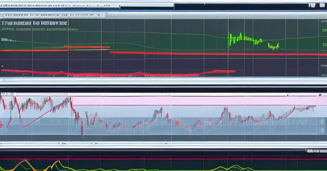
Exploring the Four Primary Forex Chart Types
While the core concept of plotting price against time remains constant, Forex trading platforms offer different ways to visualize this data. Each type presents information with varying levels of detail, catering to different analytical needs. Let’s explore the four main types:
- Line Charts: The simplest form, connecting the closing prices of each period with a line. Ideal for getting a quick overview of trends and spotting key support/resistance levels over longer periods. They filter out intraday noise but don’t show the price range within each period.
- Mountain Charts: Essentially a Line Chart with the area below the line shaded. Similar uses as the line chart, often providing a visually pleasing way to see the overall trend flow, especially for historical data.
- Bar Charts (HLOC): More detailed than line charts, showing the High, Low, Open, and Close prices for each specific period. Provides a better sense of volatility and price range within the period.
- Candlestick Charts: The most popular type among active traders due to their rich visual information display. They show the same HLOC data as bar charts but present it in a format that makes market sentiment and potential reversals easier to interpret quickly.
While Line and Mountain charts are useful for big-picture views, Bar and Candlestick charts are where the detailed action happens, offering insights into the battle between buyers and sellers within each timeframe.
Deconstructing Bar (HLOC) Charts: A Clear Look at the Data
The Bar Chart, often referred to as an HLOC chart (High-Low-Open-Close), provides a concise summary of price action within a given timeframe. Each vertical bar represents a specific period (e.g., 15 minutes, 1 hour, 1 day).
Here’s how to interpret a single bar:
- The vertical line itself shows the total range of price movement during that period, from the lowest point to the highest point. The bottom of the line is the Low Price, and the top is the High Price.
- A small horizontal line extending to the left of the vertical bar marks the Open Price – the price at which trading began for that period.
- A small horizontal line extending to the right of the vertical bar marks the Close Price – the price at which trading ended for that period.
By looking at a series of bars, you can quickly gauge volatility (longer bars mean higher range), the relationship between open and close (did price move up or down overall?), and where the closing price landed within the total range. This gives you a good snapshot of the trading activity in each period, offering more information than a simple line connecting closing prices.
Mastering Candlestick Chart Interpretation: Unveiling Market Sentiment
Candlestick charts, originating in 17th-century Japan, have become the go-to chart type for modern Forex traders. Their visual appeal and the depth of information they convey about market psychology make them incredibly powerful. Each candlestick represents the price action for a chosen timeframe, just like a bar chart, but they are structured differently to highlight the relationship between the Open and Close prices.
Let’s break down the components of a single candlestick:
- The Body: This is the thick rectangular part of the candlestick. It represents the range between the Open Price and the Close Price. The color of the body tells us immediately whether the price rose or fell during the period.
- If the Close Price is higher than the Open Price, the body is typically colored bullishly (often green or white). This indicates that buyers were in control during that period, pushing the price up from where it opened.
- If the Close Price is lower than the Open Price, the body is colored bearishly (often red or black). This signals that sellers were dominant, driving the price down from the open.
- The Wicks or Shadows: These are the thin lines that extend from the top and bottom of the body. The upper wick reaches up to the High Price of the period, and the lower wick reaches down to the Low Price. The wicks show the full range of price movement, including the extremes reached before the period closed.
The length of the body and the wicks are crucial for interpretation. A long body indicates strong buying or selling pressure, resulting in a significant price move between open and close. A short body suggests less intense pressure or market indecision, with the open and close prices being relatively close.
Long wicks, on the other hand, tell a story of price rejection. A long upper wick with a short body might suggest that buyers initially pushed the price high, but sellers stepped in aggressively to push it back down before the period ended. Conversely, a long lower wick might indicate that sellers tried to drive the price down, but buyers defended the lower levels and pushed it back up. These visual cues provide invaluable insights into the battle between bulls and bears within each specific timeframe.
Are you starting to see how these simple shapes can speak volumes about market sentiment?
Special Candlesticks: Signals of Indecision and Potential Change
Certain candlestick formations are particularly noteworthy because they often signal moments of market indecision or potential turning points. The most classic example is the Doji.
A Doji forms when the Open Price and the Close Price are very close, or even identical. The body is therefore very small or non-existent. The wicks, however, can vary in length, showing the range of volatility during the period even as the net movement between open and close was minimal.
What does a Doji tell us? It suggests that during that timeframe, neither buyers nor sellers could gain significant control. The market is in a state of equilibrium, pausing to decide its next move. While a single Doji in isolation might not be a strong signal, its appearance, especially after a prolonged trend, can be a powerful indicator of potential trend exhaustion or reversal. It prompts us to pay close attention to the subsequent candlestick to see which direction the market finally breaks.
Other candlestick patterns combine multiple candles to tell more complex stories, but understanding the basic structure and the significance of body and wick lengths is the essential first step.
Connecting Charts to the Pulse of the Market: Fundamentals and News
While technical analysis using charts focuses on historical price data, it’s critical to remember that these charts are not created in a vacuum. They are the direct result of market participants reacting to a myriad of factors, including underlying fundamental economic conditions and news events.
Economic data serves as a primary catalyst for short-term volatility and price movements in the Forex market. Major economic indicators, such as interest rate decisions by central banks, inflation rates (like CPI and PPI), employment figures (like the crucial Non-Farm Payrolls in the U.S.), GDP growth, and retail sales, significantly influence currency valuations.
Given the U.S. dollar’s prevalence in currency pairs, economic news releases from the United States typically exert the most significant and immediate impact on global Forex markets. When a key U.S. report is released, you will often see sudden, sharp moves on the USD pairs charts as traders react to the new information. These reactions are instantly visualized on your charts as rapid price changes, potentially creating long candles, sudden spikes, or breakouts from periods of consolidation.
The effect of significant news releases on currency prices can persist for several hours or even days. This is why successful trading often requires understanding *why* prices are moving, linking the visual information on your charts to the fundamental drivers impacting supply and demand for a currency. Charts show *what* happened; understanding fundamentals helps explain *why* it happened and potentially *what might happen next* if similar conditions arise.
Reading technical chart elements like candlestick bodies, wicks, and patterns (like dojis) after a period of volatility often triggered by news can provide insights into the balance of buying and selling pressure and potential market turning points. For example, a long wick pushing back against a news-driven move might indicate that the initial reaction was overdone and that opposing pressure is entering the market.
Putting it Together: Chart Reading as a Skill
Reading Forex charts is a skill that develops with practice and requires a combination of theoretical knowledge and practical application. As you look at charts, you’re not just passively observing; you’re actively interpreting the story the market is telling.
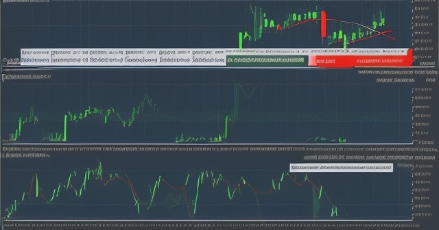
- Look at trends: Is price generally moving up (uptrend), down (downtrend), or sideways (ranging)?
- Identify key levels: Where has price previously bounced (support) or met resistance (resistance)? These often appear as horizontal lines where price action repeatedly paused or reversed.
- Analyze individual bars/candlesticks: What does the size and shape of the most recent price action tell you about the strength of buyers and sellers?
- Look for patterns: Certain sequences of bars or candlesticks form recognizable patterns (like head and shoulders, triangles, or specific candlestick reversal patterns) that technical analysts believe have predictive qualities.
Think of each bar or candlestick as a single word or short sentence in the market’s narrative. By stringing these together, you begin to read the paragraphs and chapters of price action, building a comprehensive understanding of the market’s behavior.
If you’re considering exploring different platforms to practice your chart reading skills and perhaps begin trading, understanding the charting tools available is key. Choosing a platform that offers robust, customizable charts across various timeframes is essential.
Choosing the Right Tools: Platforms and Practice
Your ability to effectively read charts is heavily reliant on the quality of the charting tools provided by your trading platform. A good platform will offer real-time data, multiple chart types, various timeframes, and the ability to add technical indicators and drawing tools (like trend lines, support/resistance lines, etc.) directly onto the charts.
Popular platforms like MetaTrader 4 (MT4), MetaTrader 5 (MT5), and newer web-based platforms offer advanced charting capabilities. They allow you to customize the appearance of your charts, save layouts, and quickly switch between currency pairs and timeframes.
Consistent practice is vital. Spend time observing live charts, even if you aren’t trading. Look at historical charts and see how price behaved around news events or after specific candlestick formations. The more time you spend interacting with charts, the more intuitive their language will become.
In choosing a trading platform, the flexibility and technical advantages it offers can significantly enhance your chart analysis experience. For instance, Moneta Markets supports popular platforms like MT4, MT5, and Pro Trader, combining high-speed execution with competitive spreads, which contributes to a good trading environment where your chart analysis can be put into practice efficiently.
Don’t feel pressured to understand everything at once. Start with the basics: identifying HLOC, understanding bullish and bearish candlesticks, and recognizing clear trends. Build your knowledge gradually.
Recognizing the Risks: Charts as Analysis Tools, Not Crystal Balls
While charts are incredibly powerful analytical tools, they are not foolproof predictors of future price movements. They show us probabilities based on historical behavior, but the Forex market is influenced by a constant stream of new information and unforeseen events.
It’s crucial to approach trading with realistic expectations and a strong understanding of the risks involved. Instruments like Contracts for Difference (CFDs), which are often used to trade Forex, carry a high risk of losing money rapidly due to leverage. Leverage allows you to control a larger position with a smaller amount of capital, amplifying both potential profits and potential losses.
Reports consistently show that a significant percentage of retail client accounts lose money when trading CFDs. This isn’t meant to discourage you, but to ground you in the reality of trading. Charts are essential for analysis and decision-making, but they must be used as part of a broader trading plan that includes robust risk management strategies.
Never trade with money you cannot afford to lose. Utilize tools like stop-loss orders, which you can set based on levels identified through your chart analysis, to limit potential losses on a trade.
Beyond the Basics: What’s Next in Your Chart Journey?
Once you’re comfortable reading individual bars and candlesticks and understanding the basic chart types and timeframes, you can delve deeper into the world of technical analysis. This includes studying:
- Chart Patterns: Recognizing formations like triangles, flags, pennants, double tops/bottoms, and head and shoulders that suggest potential continuations or reversals of trends.
- Technical Indicators: Learning how to use mathematical calculations based on price data, such as Moving Averages, MACD, RSI, Stochastic Oscillators, and Bollinger Bands, to help confirm signals and identify potential entry/exit points. These indicators are often displayed overlaid on or below the price chart.
- Support and Resistance: Mastering the identification and significance of these key price levels where buying or selling pressure is expected to be strong. Charts are the primary tool for visualizing these levels.
- Trend Analysis: Drawing trend lines and channels on charts to define the direction and momentum of price movement.
Each of these areas builds upon the fundamental skill of simply reading what the price chart is showing you. They are tools designed to help you gain further insights and identify higher-probability trading opportunities based on the visual evidence presented by the chart.
If you are researching potential brokers and their offerings, consider that a broker like Moneta Markets is regulated by authorities such as FSCA, ASIC, and FSA. This multi-jurisdictional regulation, coupled with features like segregated client funds and 24/7 support, can provide peace of mind as you focus on honing your trading skills and applying your chart analysis.
Conclusion: Your Visual Guide to the Forex Market
Reading Forex charts is the gateway to understanding market price action. By learning to interpret the different chart types – from the simplicity of Line charts to the detail of Bar charts and the rich sentiment data of Candlestick charts – you gain a powerful tool for technical analysis.
Remember that charts display the output of market forces, including the significant impact of economic news and fundamental data. Your ability to connect the visual information on the chart with the underlying market drivers will become increasingly important as you progress.
Approaching charts with a blend of technical knowledge and an awareness of fundamental context, while always practicing diligent risk management, is the path to potentially navigating the Forex market successfully. Continue practicing, keep learning, and let the charts be your experienced guide through the dynamic world of currency trading.
| Chart Type | Description | Best For |
|---|---|---|
| Line Chart | Connects closing prices over time. | Trend overview |
| Mountain Chart | Similar to line chart with shaded areas. | Visual trends |
| Bar Chart | Displays High, Low, Open, and Close data. | Volatility analysis |
| Candlestick Chart | Visual and detailed representation of price action. | Active trading strategies |
| Timeframe | Characteristics | Use |
|---|---|---|
| 1-Minute | Tick-by-tick data | Scalping |
| 1-Hour | Consolodates hourly data | Day trading |
| Daily | Summarizes a full day’s price action | Swing trading |
| Weekly | Provides broader trends | Long-term analysis |
| Trading Tool | Key Features | Benefits |
|---|---|---|
| MetaTrader 4 (MT4) | Real-time data, multiple chart types | Customization and flexibility |
| MetaTrader 5 (MT5) | Advanced analytics, more timeframes | Better insights and analysis |
| Web-based Platforms | Accessible from any device | Convenience and ease of use |
how to read forex chartsFAQ
Q:What are the main types of Forex charts?
A:The main types include Line Charts, Mountain Charts, Bar Charts, and Candlestick Charts.
Q:How does timeframe affect chart analysis?
A:Timeframe dictates how much time each data point represents, impacting the granularity and the insights you can derive.
Q:Why are candlestick charts popular among traders?
A:Candlestick charts provide rich visual information and help interpret market sentiment more effectively than other chart types.