
Unveiling the Secrets of Technical Analysis: Your Guide to Charting Success
Welcome to the world of technical analysis! If you’re an investor or trader, whether just starting out or looking to deepen your understanding, you’ve likely encountered this powerful discipline. Forget trying to predict the future based on complex economic forecasts or company earnings reports for a moment. Technical analysis offers a different perspective, one grounded in the study of market action itself.
We’re here to guide you through this fascinating approach. Think of us as your companion on this journey, breaking down complex ideas into digestible insights. Technical analysis, often abbreviated as TA, is the study of historical price and volume data to forecast the direction of prices. It operates on a set of core assumptions that we’ll explore, providing a framework for understanding market behaviour. It’s not magic, but rather a method rooted in the idea that market psychology and supply and demand leave observable footprints on charts.
In the following sections, we will embark on a comprehensive exploration, moving from the fundamental principles that underpin TA to the practical tools and techniques you can use to analyze charts and make informed decisions. We’ll look at different chart types, learn how to identify key levels like support and resistance, understand the power of trends and patterns, and delve into the world of technical indicators. Ready to start decoding the language of the markets?

Every discipline has its bedrock, its fundamental truths upon which all else is built. For technical analysis, these foundational principles are crucial. Understanding them isn’t just academic; it informs how you interpret every chart, every indicator, every pattern. There are three core principles that serve as the foundation of technical analysis. Let’s explore them.
- The market action discounts everything
- Prices move in trends
- History tends to repeat itself
| Principle | Description |
|---|---|
| Market Action Discounts Everything | The price reflects all known Information |
| Prices Move in Trends | Trends exist in market movements |
| History Tends to Repeat Itself | Market psychology leads to recurring patterns |
Together, these three principles form a robust framework. They shift the focus from analyzing the underlying value or external forces (like fundamental analysis does) to analyzing the market itself – its price, volume, and historical behaviour. By accepting these principles, you gain a new lens through which to view and interact with financial markets.
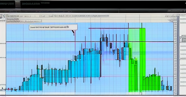
Charts are the primary tools of a technical analyst. They are visual representations of price movements over time. Different types of charts present this data in slightly different ways, each offering unique advantages and insights. Understanding these variations is essential for effectively reading the market landscape.
Let’s start with the simplest: the Line Chart. This chart connects a series of data points, typically the closing price, over a specific time frame. It provides a clear, uncluttered view of the overall price trend. Line charts are excellent for visualizing the general direction of the market and are often used for longer-term perspectives or to compare the performance of multiple assets. However, they lack detail about the price movement *within* each period (e.g., the high, low, or opening price).
Next is the Bar Chart. A bar chart provides more information than a line chart. Each vertical bar represents a single trading period (e.g., a day, a week, an hour). The top of the bar indicates the highest price reached during that period, and the bottom indicates the lowest price. A small horizontal line to the left of the bar shows the opening price, and a small horizontal line to the right shows the closing price. These charts give you a sense of volatility within the period and the relationship between opening and closing prices, but they can sometimes appear cluttered.
Perhaps the most popular chart type among traders is the Candlestick Chart. Originating in Japan centuries ago, candlestick charts are visually rich and easy to interpret once you understand their components. Like bar charts, each candlestick represents a trading period. The ‘body’ of the candlestick is the rectangular part, representing the range between the opening and closing prices. The ‘wicks’ or ‘shadows’ are the thin lines extending above and below the body, indicating the high and low prices for the period.
Here’s how to read candlestick colours (though this can vary slightly based on platform settings):
- If the closing price is higher than the opening price, the body is typically filled (e.g., green or white). This is a bullish candlestick, suggesting buying pressure.
- If the closing price is lower than the opening price, the body is typically hollow or a different color (e.g., red or black). This is a bearish candlestick, suggesting selling pressure.
Candlestick charts are favoured because they quickly convey a lot of information about the price action within a period and form recognizable patterns that often signal potential price movements. We’ll touch on some basic candlestick patterns later, but mastering chart reading is the first step in becoming a proficient technical analyst.
Imagine a ball bouncing within a room. There’s a floor it hits and bounces off, and a ceiling it hits and comes back down from. In financial markets, price levels often act like these invisible floors and ceilings. These are known as Support and Resistance.
Support is a price level where a downtrend is expected to pause due to a concentration of demand. Think of it as a floor. When the price falls to a support level, buyers tend to step in, seeing the asset as undervalued or simply a good place to buy, preventing the price from falling further, at least temporarily. This increased buying pressure can cause the price to bounce back up.
Conversely, Resistance is a price level where an uptrend is expected to pause due to a concentration of supply. Think of it as a ceiling. When the price rises to a resistance level, sellers tend to step in, seeing the asset as overvalued or a good place to take profits, preventing the price from rising further. This increased selling pressure can cause the price to pull back down.
Why do these levels form? They are heavily influenced by market psychology and past price action.
- Previous highs often become future resistance.
- Previous lows often become future support.
- Levels where the price consolidated for a period can act as both support and resistance depending on whether the price is above or below them.
The more times a price level has acted as support or resistance and held, the stronger that level is considered to be. These levels aren’t always exact points; they are often better viewed as zones or areas on the chart.
A critical concept is the potential for these levels to switch roles. When a resistance level is convincingly broken by rising prices, it often turns into a new support level. Similarly, when a support level is broken by falling prices, it frequently becomes a new resistance level. This phenomenon is often referred to as the ‘support-becomes-resistance’ or ‘resistance-becomes-support’ principle and is a powerful concept in identifying potential entry or exit points.
Identifying support and resistance is fundamental because it helps you anticipate potential turning points in the market. It’s one of the first things many technical analysts look for on a chart.
As we learned earlier, prices tend to move in trends. Trend lines and channels are graphical tools used by technical analysts to visually identify and confirm these trends, helping you ride the market’s wave.
A Trend Line is a straight line drawn on a chart to connect a series of prices, indicating the direction of the trend.
- In an Uptrend, a trend line is drawn by connecting at least two significant consecutive low points. This line slopes upwards and acts as dynamic support. Prices bouncing off this ascending trend line suggest the uptrend remains intact.
- In a Downtrend, a trend line is drawn by connecting at least two significant consecutive high points. This line slopes downwards and acts as dynamic resistance. Prices hitting and falling back from this descending trend line suggest the downtrend is continuing.
A valid trend line requires at least two points, but three or more points touching or coming close to the line make it a stronger, more significant trend line. A break below an uptrend line or above a downtrend line can signal a potential trend reversal or a shift to a sideways market.
A Channel takes the trend line concept a step further. It consists of two parallel trend lines that contain price action.
- An Uptrend Channel has an upper line connecting highs (resistance) parallel to the lower trend line connecting lows (support).
- A Downtrend Channel has a lower line connecting lows (support) parallel to the upper trend line connecting highs (resistance).
- A Horizontal Channel (or rectangle/range) has two parallel horizontal lines, one acting as resistance and one as support, indicating a sideways trend.
Trading within channels involves buying near the support line and selling near the resistance line, assuming the channel will hold. A break out of a channel – either above an uptrend channel or below a downtrend channel – can signal an acceleration of the trend or the beginning of a new, steeper trend. Conversely, a break in the opposite direction can signal a potential reversal.
Using trend lines and channels helps you not only identify the direction of the current trend but also estimate potential price targets and identify levels where the trend might be tested or broken. They are simple yet powerful tools for visualizing the structure of the market’s movement.

Chart patterns are specific formations on price charts that technical analysts believe are predictive of future price movements. These patterns are visual representations of the ongoing battle between buyers and sellers and are thought to reflect common psychological states of market participants. Recognizing these patterns can provide potential trading signals.
Chart patterns are broadly categorized into two types: Continuation Patterns and Reversal Patterns.
Continuation Patterns suggest that once the pattern is completed, the preceding trend is likely to continue. They represent a pause or consolidation phase within an existing trend before it resumes. Common examples include:
- Flags and Pennants: These are short-term patterns that form after a sharp price move (the ‘pole’). A flag is a small parallelogram, while a pennant is a small triangle. Both represent a brief consolidation, and a breakout in the direction of the original trend is anticipated. The potential price target is often estimated by adding the length of the ‘pole’ to the breakout point.
- Triangles (Symmetrical, Ascending, Descending): These patterns show price converging within a triangle shape. A symmetrical triangle has converging trend lines, suggesting indecision. An ascending triangle has a flat top (resistance) and rising lows, suggesting bullish pressure. A descending triangle has a flat bottom (support) and falling highs, suggesting bearish pressure. A breakout from a triangle indicates the likely direction of the next move.
Reversal Patterns suggest that the preceding trend is likely to reverse once the pattern is completed. They indicate that the balance of power between buyers and sellers is shifting. Common examples include:
- Head and Shoulders: This is one of the most well-known reversal patterns, typically found at the top of an uptrend. It consists of three peaks: a central, highest peak (the ‘head’) and two lower peaks on either side (the ‘shoulders’). A ‘neckline’ is drawn connecting the lows between the peaks. A break below the neckline after the right shoulder is formed is a strong bearish signal. An inverse Head and Shoulders pattern occurs at the bottom of a downtrend and signals a potential bullish reversal.
- Double Top and Double Bottom: A double top is a bearish reversal pattern formed by two consecutive peaks at roughly the same price level, with a trough in between. It looks like the letter ‘M’. A break below the low of the trough (the neckline) confirms the pattern. A double bottom is a bullish reversal pattern formed by two consecutive troughs at roughly the same price level, with a peak in between. It looks like the letter ‘W’. A break above the high of the peak confirms the pattern.
- Triple Top and Triple Bottom: Similar to double tops and bottoms, but with three peaks or troughs. These are less common but are considered even stronger reversal signals when confirmed by a break of the neckline.
While recognizing patterns is valuable, remember that they are not guaranteed predictions. They provide probabilities. Confirmation (like a strong price move and increased volume on the breakout) is often needed before taking a trade based on a pattern. Practice is key to identifying these patterns accurately on live charts.
While charts show you price action directly, technical indicators are mathematical calculations based on price, volume, or both. They are typically plotted above, below, or directly on the price chart and are used to generate trading signals, confirm trends, or identify potential turning points. Think of them as analytical tools that give you a different perspective on the market data.
There are hundreds, if not thousands, of technical indicators available, but some are more popular and widely used than others. Let’s explore a few essential categories and examples.
| Indicator Type | Example | Purpose |
|---|---|---|
| Trend-Following | Moving Averages | Identify direction and strength of trend |
| Oscillators | Relative Strength Index (RSI) | Identify overbought/oversold conditions |
| Volatility | Bollinger Bands | Measure price fluctuations |
Remember that no single indicator is perfect, and relying on just one can be misleading. Professional traders often use a combination of indicators, along with chart patterns and support/resistance levels, to confirm signals and build a more robust trading strategy. Think of indicators as tools to help you analyze probabilities, not predictors of certainties.
If you’re considering starting forex trading or exploring more CFD instruments, then Moneta Markets is a platform worth considering. Hailing from Australia, it offers over 1000 financial instruments, making it a suitable choice for both beginners and professional traders.
Price tells you *what* is happening, but Volume tells you *how much* conviction is behind that movement. Volume represents the total number of shares, contracts, or units of a security that have been traded during a specific period. It’s the fuel that drives price action, and analyzing it alongside price is a crucial aspect of technical analysis.
High volume indicates strong interest and participation in the current price movement, whether it’s buying or selling. Low volume suggests less interest or conviction. By observing the relationship between price and volume, you can gain valuable insights.
Here are some key interpretations when integrating volume analysis:
- Confirming Trends: In a healthy uptrend, you typically want to see volume increase on upswings (days/periods where price closes higher) and decrease on pullbacks (days/periods where price closes lower). This suggests that buyers are entering the market with conviction and sellers are less aggressive on dips. Conversely, in a healthy downtrend, you’d expect volume to increase on downswings and decrease on bounces.
- Signaling Reversals: Divergence between price and volume can signal potential trend exhaustion or reversal. For example, if a market is making new highs but volume is decreasing on each subsequent push up, it might indicate that the buying pressure is weakening, and the uptrend is losing momentum. A sharp increase in volume on a price break below support in an uptrend, or above resistance in a downtrend, can strongly confirm a reversal signal.
- Confirming Breakouts: When price breaks out of a consolidation pattern (like a triangle or channel) or above a significant resistance level or below a significant support level, a surge in volume adds credibility to the breakout. A breakout on low volume is often viewed with suspicion and might turn out to be a false move.
- Identifying Distribution/Accumulation: Periods of high volume with little price movement can sometimes indicate accumulation (smart money buying) or distribution (smart money selling) before a significant move.
Many platforms offer volume indicators, such as On-Balance Volume (OBV) or Volume Rate of Change (VROC), which process volume data to provide signals. However, simply observing the raw volume bars at the bottom of your price chart in conjunction with price action is a powerful technique in itself.
Volume adds depth to your analysis. It helps you understand the strength behind the moves you see on the price chart, allowing for more confident trading decisions and helping you filter out potential head fakes or weak signals.
Technical analysis isn’t just about finding opportunities to enter trades; it’s equally, if not more, important for managing risk *after* you’ve entered a position. Risk management is paramount in trading, and TA provides essential tools to help you protect your capital.
One of the most critical risk management tools is the Stop-Loss Order. This is an order placed with your broker to automatically close your position if the price reaches a certain level, thereby limiting your potential loss on a trade. Technical analysis helps you determine *where* to place this stop-loss order logically.
- If you buy a stock in an uptrend, a common place to put your stop-loss is just below a key support level or just below the uptrend line. If the price falls below this level, the technical structure of the trade is broken, suggesting your initial bullish premise might be wrong, and it’s time to exit with a limited loss.
- If you sell a stock (short) in a downtrend, your stop-loss might be placed just above a key resistance level or just above the downtrend line. A price break above this level invalidates your bearish view.
| Stop-Loss Strategy | Description |
|---|---|
| For Long Positions | Place stop-loss below support or uptrend line. |
| For Short Positions | Place stop-loss above resistance or downtrend line. |
Placing stop-losses based on logical technical levels, rather than arbitrary price points or a fixed percentage, aligns your risk management with your trading strategy. It acknowledges that if the market moves against you past a certain technical barrier, the trade is no longer working as anticipated.
Similarly, technical analysis helps in setting Take-Profit Levels – points where you aim to close a profitable trade.
- Previous resistance levels can be potential take-profit targets for a long (buy) position.
- Previous support levels can be potential take-profit targets for a short (sell) position.
- Measured moves derived from chart patterns (like the height of a triangle added to the breakout point) also provide potential price targets.
By identifying potential profit targets using TA, you can define the potential reward of a trade and compare it to the potential risk (defined by your stop-loss) before entering. This leads to the concept of the Risk/Reward Ratio, which should ideally be favorable (e.g., aiming to make at least twice as much as you risk). Technical analysis gives you the framework to calculate this ratio for each potential trade setup.
Furthermore, technical analysis aids in Position Sizing – determining how many shares, contracts, or units to trade. Knowing your stop-loss level allows you to calculate the dollar amount you would lose if the stop is hit. By deciding how much of your total capital you are willing to risk on any single trade (often a small percentage, like 1% or 2%), you can then calculate the appropriate position size.
In summary, technical analysis is not just a tool for finding trades but a critical component of a robust risk management plan. It provides the structure needed to place logical stop-losses, set realistic profit targets, calculate risk/reward ratios, and determine appropriate position sizes, all of which are vital for capital preservation over the long term.
While some traders rely exclusively on technical analysis, many find that combining it with other analytical approaches can lead to more robust and higher-probability trading strategies. Technical analysis provides insights into market timing and sentiment, while other methods can offer context or independent signals.
One common combination is integrating Technical Analysis with Fundamental Analysis. Fundamental analysis focuses on a company’s intrinsic value by examining economic data, industry trends, and company-specific information (earnings, management, debt, etc.).
- Fundamental analysis might help you identify *what* to buy or sell (e.g., a fundamentally strong company or an undervalued asset).
- Technical analysis can then help you determine *when* to buy or sell that asset, providing specific entry and exit points based on chart patterns, support/resistance, or indicator signals.
For instance, if fundamental analysis suggests a company is poised for growth, technical analysis might help you find the optimal time to enter a long position after a bullish chart pattern forms or the price breaks above resistance.
Another synergistic approach is combining different Technical Analysis Tools. Instead of using just one indicator or one type of pattern, layering multiple TA tools can help confirm signals and reduce false positives.
- You might look for a bullish candlestick pattern (like a Hammer) forming at a key support level that also coincides with an oversold reading on the RSI indicator. The confluence of these signals can provide greater confidence in the trade setup.
- Using a long-term moving average to identify the overall trend direction, and then using a shorter-term moving average or an oscillator to time entries within that trend, is another example of combining TA tools.
The goal isn’t to clutter your charts with dozens of indicators, but to select a few that complement each other and provide clear confirmation signals.
Some traders also incorporate Macroeconomic Analysis, looking at broad economic trends, interest rates, and central bank policies. While seemingly distinct, major economic announcements or shifts can significantly impact market sentiment and initiate new trends. Technical analysis can help you observe *how* the market reacts to these events on the chart and identify potential trading opportunities or risks arising from macro changes.
Finally, understanding Market Structure and Order Flow can complement traditional TA. While more advanced, these concepts look at the underlying mechanics of how orders are placed and executed, sometimes providing clues that support or challenge the patterns and levels identified through standard charting techniques.
By strategically combining technical analysis with other forms of market analysis, you can potentially improve your decision-making process, increase the probability of successful trades, and gain a deeper understanding of the forces at play in the markets you trade.
When choosing a trading platform, Moneta Markets‘ flexibility and technological advantages are worth mentioning. It supports popular platforms like MT4, MT5, and Pro Trader, combined with high-speed execution and low spread settings, offering a good trading experience.
Trading is as much a psychological game as it is analytical. Even with a deep understanding of technical analysis, your emotions can significantly impact your performance. Fear and greed are powerful forces that can lead traders to make irrational decisions, overriding even the best-laid technical plans.
This is where the disciplined application of technical analysis becomes invaluable as a psychological tool. By developing a systematic approach based on technical signals, you create a framework that helps you manage your emotions and make objective decisions.
How does technical analysis help with trading psychology?
- Provides Objectivity: TA provides clear, visual signals. Instead of making decisions based on gut feeling, rumour, or panic, you can refer to your chart and your planned technical strategy. Is the price still above support? Has the indicator given a buy signal? Sticking to these objective criteria reduces emotional bias.
- Helps Define Risk: As discussed, TA helps set logical stop-loss levels. Knowing your maximum potential loss *before* entering a trade significantly reduces anxiety and fear of ruin. It allows you to accept the potential loss as part of the trading cost if the stop is hit, rather than making impulsive decisions based on fear as the price moves against you.
- Sets Expectations: Chart patterns, support/resistance levels, and indicators can provide potential price targets and probabilities. This helps manage greed by providing logical points to take profits rather than holding on for unrealistic gains and risking a reversal.
- Encourages Patience and Discipline: TA often requires waiting for specific setups to form. This fosters patience, preventing impulsive entries. Executing trades only when your predetermined technical criteria are met builds discipline, which is crucial for long-term success.
- Provides a Framework for Review: After a trade, whether winning or losing, reviewing your decision against your technical strategy helps you learn. Did you miss a signal? Did you ignore a warning? This analytical review process, guided by technical principles, is far more productive than dwelling on emotional regrets.
It’s easy to look at a historical chart and see the patterns clearly, but trading in real-time, with money on the line, is different. Prices move quickly, and emotions flare. Having a pre-defined technical plan – based on your analysis of charts, patterns, and indicators – acts as your anchor in the storm. It’s your reference point when the market noise and emotional impulses try to steer you off course.
Mastering technical analysis is not just about understanding charts; it’s about using that understanding to build a disciplined trading approach that helps you conquer your own psychological biases. This self-mastery is arguably the most challenging, yet most rewarding, aspect of becoming a successful trader.
We’ve covered a significant amount of ground, from the core principles of technical analysis to different chart types, key levels, patterns, indicators, volume, risk management, combining approaches, and the crucial role of psychology. Now, how do you synthesize all this knowledge into a practical, actionable blueprint for your own trading?
Think of technical analysis as providing the components for building your personal trading strategy. There’s no single “right” way to use TA; what works best often depends on your personality, trading style (e.g., day trading, swing trading, long-term investing), the markets you trade, and your risk tolerance.
Here’s a suggested process for developing your TA-based blueprint:
- Define Your Timeframe: Are you looking for short-term moves (intraday charts) or longer-term trends (daily, weekly charts)? Your timeframe will dictate which charts you focus on and potentially which indicators are most relevant.
- Choose Your Core Tools: Select a few technical tools that resonate with you and that you understand well. This might be a combination of:
- Identifying key Support and Resistance levels.
- Drawing Trend Lines and Channels.
- Looking for specific Chart Patterns (e.g., Flags, Head and Shoulders).
- Using one or two confirming Technical Indicators (e.g., a Moving Average crossover, RSI overbought/oversold signals).
Keep it relatively simple initially. You can always add more tools as you gain experience.
- Develop Your Trading Rules: Based on your chosen tools, define clear rules for when you will enter a trade, where you will place your stop-loss, and where you will look to take profits. For example, a rule might be: “Enter a long trade only when price breaks above a significant resistance level on above-average volume, the RSI is not overbought, and place the stop-loss just below the breakout level.”
- Practice and Backtest: Before trading with real money, practice identifying your chosen setups on historical charts (backtesting) and perhaps trade on a demo account (paper trading). This helps you refine your rules and build confidence without risking capital.
- Execute with Discipline: Once you move to live trading, stick to your plan. Avoid making impulsive decisions based on fear, hope, or excitement. This is where managing your trading psychology becomes paramount.
- Review and Adapt: Regularly review your trades. What worked? What didn’t? Was it an issue with your analysis, your rules, or your execution (psychology)? Use this review process to adapt and improve your trading blueprint over time.
Technical analysis provides a powerful framework for understanding market dynamics and making trading decisions. It empowers you to read the collective actions of market participants directly from the price chart. By learning its principles, mastering its tools, and applying them within a disciplined trading plan, you can build your own blueprint for navigating the financial markets and working towards your trading goals. The journey of learning TA is continuous; keep exploring, keep practicing, and keep refining your skills.
exposherFAQ
Q:What is technical analysis?
A:Technical analysis is the study of historical price and volume data to forecast the direction of prices in financial markets.
Q:How do I determine support and resistance levels?
A:Support and resistance levels are identified by analyzing previous price highs and lows and areas where price action has consolidated.
Q:What role does volume play in trading?
A:Volume indicates the strength of price movements. High volume can confirm trends or reversals, while low volume may suggest weak conviction.