
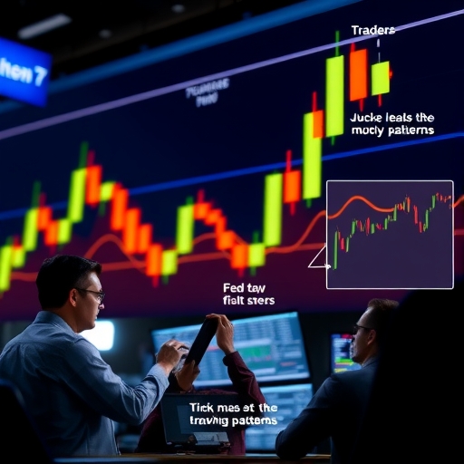
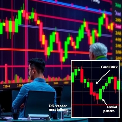
Understanding Candlestick Patterns: Your Comprehensive Guide to Market Signals
Welcome, future market analysts! We’re embarking on a journey into the fascinating world of technical analysis, specifically focusing on one of its most visually intuitive and powerful tools: candlestick charts and their patterns. Think of these charts not just as lines on a graph, but as a rich language spoken by the market itself. Each candlestick is a word, and arrangements of these words form patterns – powerful sentences that can tell us a story about the ongoing battle between buyers and sellers, and potentially, where prices might be headed next.
For both novice investors taking their first steps and experienced traders seeking deeper insights, understanding candlestick patterns is fundamental. They offer a quick way to gauge market sentiment, identify potential turning points, and even confirm signals from other indicators. But like any language, it requires learning the vocabulary and the grammar. That’s exactly what we’re here to do – demystify this visual language and show you how to translate market whispers into potential trading opportunities.
Throughout this guide, we will explore the building blocks of candlesticks, delve into the most common and reliable patterns across different categories (bullish, bearish, continuation, and neutral), and most importantly, discuss how to apply this knowledge practically in your trading decisions. Ready to start reading the market’s mind through candlesticks? Let’s begin.
The Anatomy of a Candlestick: Deciphering the Building Blocks
Before we can understand the patterns, we need to understand the individual candlestick itself. Each candle represents the price action of an asset (like a stock, currency pair, or commodity) over a specific timeframe. This could be one minute, one hour, one day, one week, or even one month. What essential information does a single candle convey?
It captures four crucial price points within that timeframe: the Open, the High, the Low, and the Close. Think of it like summarizing a day’s activity on the market in one visual snapshot.
-
The Body: This is the thick part of the candlestick. It represents the range between the open price and the close price. The color of the body is key to understanding the primary direction of price movement during that period.
-
Color Significance: Typically, a green (or white) body indicates that the close price was higher than the open price. This is a bullish candle, suggesting buying pressure dominated the period. A red (or black) body indicates that the close price was lower than the open price. This is a bearish candle, suggesting selling pressure was stronger.
-
The Wicks or Shadows: These are the thin lines extending above and below the body. They represent the highest and lowest prices reached during the timeframe. The upper wick (or upper shadow) extends from the top of the body to the high price. The lower wick (or lower shadow) extends from the bottom of the body to the low price.
So, a long green body with short wicks tells us that buyers were strongly in control, pushing the price up significantly from open to close with little retracement. Conversely, a long red body with short wicks suggests sellers were dominant, driving the price down. A candle with a small body but long wicks, like a Doji or a Spinning Top, indicates indecision or a stalemate between buyers and sellers. The price moved significantly up and down during the period, but ultimately closed very near where it opened.
Understanding this anatomy is the first step. By simply looking at a single candle, you can get an immediate sense of the volatility and the dominant sentiment during its timeframe. But the real power comes when we look at sequences of these candles – the patterns.
Bullish Reversal Patterns: Spotting Potential Upturns
Now that we know how to read individual candles, let’s start combining them. Some of the most compelling signals come from bullish reversal patterns. These patterns typically form after a clear downtrend and suggest that selling pressure might be exhausting itself, and buyers are potentially stepping in to push prices higher. Identifying these patterns early can be crucial for traders looking for opportunities to enter long positions or cover short ones.
Let’s delve into some of the most important bullish reversal patterns:
-
The Hammer: Imagine a hammer shape. This is a single candlestick pattern appearing in a downtrend. It has a small body (either green or red, but green is slightly more bullish) located near the top of the candle’s range, a long lower wick (at least twice the length of the body), and little to no upper wick. What does it mean? The market opened, sellers pushed the price significantly lower (creating the long lower wick), but then strong buying pressure emerged and pushed the price all the way back up to close near the open or even higher. This shows rejection of lower prices and potential buying strength.
-
The Inverted Hammer: This is the mirror image of the Hammer, also appearing in a downtrend. It has a small body (green or red) near the bottom of the range, a long upper wick, and little to no lower wick. Here, buyers tried to push the price up significantly after the open (long upper wick), but sellers managed to push it back down to close near the open. While the close isn’t as strong as a regular Hammer, the presence of the long upper wick indicates buyers were testing higher prices, suggesting a potential shift in sentiment.
-
The Bullish Engulfing Pattern: This is a two-candle pattern found in a downtrend. The first candle is a small bearish (red/black) candle. The second candle is a large bullish (green/white) candle that completely ‘engulfs’ the body of the first candle. This pattern is highly significant because it shows that after a period of bearish control (the first candle), bulls entered the market with such force that they not only negated the previous day’s loss but pushed the price well above the previous day’s open. It’s a strong visual representation of a sudden shift in momentum.
-
The Piercing Line Pattern: Another two-candle bullish reversal pattern occurring in a downtrend. The first candle is a long bearish candle. The second candle opens significantly lower than the previous day’s close (a gap down), but then rallies strongly to close well into the body of the first bearish candle, specifically above the midpoint (50%) of the first candle’s body. This rally, especially closing above the midpoint, shows strong buying pressure emerging after a bearish push, ‘piercing’ the previous selling dominance.
-
The Morning Star Pattern: This is a three-candle pattern. It starts with a long bearish candle in a downtrend. The second candle is a small-bodied candle (it could be green, red, or even a Doji) that gaps lower than the first candle. This small candle represents indecision or a pause in the downtrend. The third candle is a strong bullish candle that closes well into the body of the first bearish candle, often gapping up from the second candle’s close. This sequence depicts the transition from bearish control, to indecision, and finally, to bullish resurgence.
These are just a few examples, but they illustrate the core idea: patterns forming at the low point of a downtrend, showing a shift from selling dominance to buying strength. Remember, spotting the pattern is the first step; confirmation from subsequent price action or other indicators is often needed to increase the probability of a successful trade.
Bearish Reversal Patterns: Identifying Potential Downturns
Just as we look for signals of a potential upward shift after a downtrend, we must also be vigilant for warnings of a potential downward shift after an uptrend. These signals are provided by bearish reversal patterns. They appear after a clear uptrend and suggest that buying pressure might be weakening, and sellers are potentially stepping in to drive prices lower. Recognizing these patterns can help traders consider exiting long positions or entering short positions.
Let’s examine some critical bearish reversal patterns:
-
The Hanging Man: The bearish counterpart to the Hammer, this single candlestick pattern appears in an uptrend. It has a small body (green or red, but red is slightly more bearish) located near the top of the candle’s range, a long lower wick, and little to no upper wick. Similar to the Hammer, the long lower wick shows that sellers managed to push prices down significantly during the period, although buyers pushed it back up to close near the open. Its appearance after an uptrend suggests that despite the close being near the open, the market attempted to move lower, indicating potential selling pressure lurking.
-
The Shooting Star: The bearish twin of the Inverted Hammer, appearing in an uptrend. It has a small body (green or red) near the bottom of the range, a long upper wick, and little to no lower wick. After the open, buyers attempted to drive prices higher (long upper wick), but sellers overwhelmed them and pushed the price back down to close near the open or even lower. This shows strong rejection of higher prices and potential selling strength entering the market.
-
The Bearish Engulfing Pattern: The opposite of the Bullish Engulfing, this two-candle pattern occurs in an uptrend. The first candle is a small bullish (green/white) candle. The second candle is a large bearish (red/black) candle that completely ‘engulfs’ the body of the first candle. This signals that after a period of bullish control (the first candle), sellers entered with such force that they not only negated the previous day’s gain but pushed the price well below the previous day’s open. It’s a powerful visual of a sudden shift from buying to selling dominance.
-
The Dark Cloud Cover Pattern: Another two-candle bearish reversal pattern in an uptrend. The first candle is a long bullish candle. The second candle opens significantly higher than the previous day’s close (a gap up), but then falls sharply to close well into the body of the first bullish candle, specifically below the midpoint (50%) of the first candle’s body. This sharp reversal after a strong open shows sellers taking control and pushing prices back down, casting a “dark cloud” over the preceding bullishness.
-
The Evening Star Pattern: The bearish counterpart to the Morning Star, this is a three-candle pattern. It begins with a long bullish candle in an uptrend. The second candle is a small-bodied candle (green, red, or Doji) that gaps higher than the first candle. This small candle represents indecision or a pause in the uptrend. The third candle is a strong bearish candle that closes well into the body of the first bullish candle, often gapping down from the second candle’s close. This sequence depicts the transition from bullish control, to indecision at the top, and finally, to bearish resurgence.
Just as with bullish patterns, these bearish formations require careful observation and confirmation. Their appearance after a significant price advance warrants paying close attention and considering potential downside movement. Are you starting to see how these visual cues can offer valuable clues about market turning points?
| Pattern | Description |
|---|---|
| The Hammer | Indicates potential buying strength after a downtrend. |
| The Hanging Man | Signals potential selling pressure after an uptrend. |
| The Bullish Engulfing Pattern | Shows a strong shift from bearish control to bullish control. |
| The Bearish Engulfing Pattern | Indicates a reversal from bullish momentum to bearish control. |
Continuation Patterns: When the Trend Persists
Not all candlestick patterns signal a reversal. Some patterns suggest that the current trend, whether it’s an uptrend or a downtrend, is likely to continue after a brief pause or consolidation. These are known as continuation patterns. They are useful for traders looking to maintain existing positions or identify potential entry points during a temporary pullback within an established trend.
Let’s explore some notable continuation patterns and related concepts:
-
The Rising Three Methods: A bullish continuation pattern occurring in an uptrend. It starts with a long bullish candle. This is followed by three small-bodied bearish candles that trade within the range of the first bullish candle. The pattern concludes with another long bullish candle that closes above the close of the first candle. This pattern demonstrates that despite a brief period of selling pressure (the three bearish candles), buyers regained control and pushed the price higher, confirming the existing uptrend.
-
The Falling Three Methods: The bearish counterpart to the Rising Three Methods, occurring in a downtrend. It starts with a long bearish candle. This is followed by three small-bodied bullish candles that trade within the range of the first bearish candle. The pattern concludes with another long bearish candle that closes below the close of the first candle. This indicates that despite a brief rally or pause (the three bullish candles), sellers reasserted dominance and pushed the price lower, confirming the existing downtrend.
-
Tasuki Gaps (Upside and Downside): These patterns involve a gap and two subsequent candles. The Upside Tasuki Gap occurs in an uptrend, starting with a bullish candle followed by a gap up and another bullish candle. The third candle is bearish and closes within the gap but doesn’t close below the first bullish candle. This suggests the uptrend is likely to continue. The Downside Tasuki Gap occurs in a downtrend, starting with a bearish candle followed by a gap down and another bearish candle. The third candle is bullish and closes within the gap but doesn’t close above the first bearish candle. This suggests the downtrend is likely to continue.
-
Rising and Falling Windows (Gaps): A “window” in candlestick charting simply refers to a gap between two candles. A Rising Window occurs when the low of a candle is higher than the high of the previous candle. This gap is often seen as potential support in an uptrend. A Falling Window occurs when the high of a candle is lower than the low of the previous candle. This gap is often seen as potential resistance in a downtrend. Gaps that remain open are strong indicators of trend continuation; if the price moves to close the gap, it can signal a potential change.
Continuation patterns remind us that markets don’t just reverse; they often pause, consolidate, and then continue their journey. Identifying these pauses as continuation signals, rather than potential reversals, is crucial for effective trend trading.
Indecision Patterns: When Buyers and Sellers Reach a Stalemate
Sometimes, the market isn’t clearly trending up or down, nor is it showing strong signs of reversal. Instead, it’s in a state of flux, with buyers and sellers seemingly evenly matched. Candlestick patterns that reflect this balance or uncertainty are known as indecision patterns. They often appear during periods of consolidation or before significant moves when the market is gathering energy or awaiting news.
While they don’t signal a specific direction, understanding indecision patterns is vital because they highlight moments of market pause, which can precede either a continuation of the prior trend or a reversal.
The most famous indecision pattern is the Doji. A Doji is characterized by a very small or non-existent body, meaning the open and close prices are virtually the same. The wicks can vary in length. A Doji signifies that neither buyers nor sellers could gain control during the period. Price moved around, but ended up right back where it started. Different types of Doji include:
-
Standard Doji: Small body, wicks of roughly equal length. Classic indecision.
-
Long-Legged Doji: Small body, very long upper and lower wicks. Shows significant price movement during the period, but ultimately closing near the open – extreme indecision and volatility.
-
Dragonfly Doji: Small body at the top of the candle’s range, a very long lower wick, and no upper wick. Formed when the price opened, was pushed down heavily by sellers, but then brought all the way back up by buyers to close at or near the open. Can be a bullish signal if appearing after a downtrend (like a Hammer without a body).
-
Gravestone Doji: Small body at the bottom of the candle’s range, a very long upper wick, and no lower wick. Formed when the price opened, was pushed up heavily by buyers, but then brought all the way back down by sellers to close at or near the open. Can be a bearish signal if appearing after an uptrend (like a Shooting Star without a body).
-
Four Price Doji: This is rare and occurs when the open, high, low, and close are all the same price. It indicates absolutely no price movement during the period – often seen in extremely illiquid assets or during periods when the market is closed but recorded (e.g., some futures markets). It represents ultimate indecision or stagnation.
Another common indecision pattern is the Spinning Top. It has a small body (green or red) and relatively long upper and lower wicks. Unlike a Doji where open and close are the same, a Spinning Top has a small body, showing some movement between open and close, but the long wicks indicate significant pushing and pulling from both buyers and sellers during the period. Like a Doji, it represents uncertainty. A series of Spinning Tops after a strong trend can suggest the trend is losing momentum.
Indecision patterns are like the market taking a breath. They don’t tell you where it will go next, but they signal that a significant move might be on the horizon after the period of uncertainty resolves. Pay close attention to what happens after an indecision pattern appears.
Advanced Pattern Recognition: Beyond the Basics
While the patterns we’ve discussed are among the most common and reliable, the world of candlestick analysis is vast. There are dozens, if not hundreds, of named patterns, some more complex or less frequently seen than others. Exploring these can provide even more nuanced insights into market dynamics. Let’s touch upon a few more patterns that you might encounter as you deepen your understanding.
-
Marubozu: This is a candle with little to no wicks. A White (or Green) Marubozu has a long white body with no wicks, indicating the low price was the open and the high price was the close. It shows strong, sustained buying pressure throughout the period. A Black (or Red) Marubozu has a long black body with no wicks, indicating the high price was the open and the low price was the close. It shows strong, sustained selling pressure. Marubozus often act as confirmation of trend strength or can be part of larger reversal patterns.
-
Harami Pattern: A two-candle pattern, often signaling potential reversal but can also be a continuation signal. It’s the opposite of an Engulfing pattern. The first candle is a large candle (bullish in an uptrend for a bearish Harami, bearish in a downtrend for a bullish Harami). The second candle is a small candle whose body is completely contained within the body of the first candle. The second candle represents indecision or a pause after the strong move of the first candle. A Harami Cross is when the second candle is a Doji – indicating even greater indecision.
-
Tweezer Tops and Bottoms: These are two (or more) candles with nearly identical highs (Tweezer Top, found in uptrends) or identical lows (Tweezer Bottom, found in downtrends). The identical highs or lows show that the market tested a specific price level and was rejected multiple times, indicating potential resistance (Tweezer Top) or support (Tweezer Bottom) and a potential reversal.
-
Three White Soldiers: A strong bullish reversal pattern occurring after a downtrend. It consists of three consecutive long bullish candles that close higher than the previous candle’s close, with minimal or small upper wicks. This shows steady, sustained buying pressure driving the price higher.
-
Three Black Crows: The bearish counterpart to Three White Soldiers, occurring after an uptrend. It consists of three consecutive long bearish candles that close lower than the previous candle’s close, with minimal or small lower wicks. This shows steady, sustained selling pressure driving the price lower.
Exploring these patterns adds layers to your analysis. Each pattern, whether simple or complex, is a visual narrative of the supply and demand dynamics during its formation. The more patterns you understand, the richer your market interpretation can become.
Applying Candlestick Patterns: Putting Knowledge Into Practice
Identifying a candlestick pattern on a chart is a crucial step, but it’s just the beginning. The true value lies in applying this knowledge to make informed trading decisions. How do we move from pattern recognition to practical application?
Firstly, remember that context is everything. A Hammer pattern is most significant when it appears after a clear downtrend, signaling a potential bottom. A Hanging Man is most relevant after a clear uptrend, signaling a potential top. Seeing a Hammer during a sideways consolidation might have less significance. Always consider the prevailing trend and the location of the pattern on the chart (e.g., near a support or resistance level).
Secondly, confirmation is key. Candlestick patterns provide signals and probabilities, but they are not guarantees. Professional traders rarely rely solely on a single candlestick pattern. They seek confirmation from subsequent price action or other technical analysis tools. For example:
-
After a bullish reversal pattern like a Hammer, confirmation would be a strong bullish candle the following day, or a move above a key resistance level.
-
After a bearish reversal pattern like a Shooting Star, confirmation might be a strong bearish candle the next day, or a break below a key support level.
-
Confirmation can also come from volume. Increasing volume on the candle that completes a reversal pattern often adds conviction to the signal.
-
Using other indicators, like moving averages, RSI, MACD, or Fibonacci levels, to confirm candlestick signals. For instance, a Bullish Engulfing pattern occurring at a key support level or coinciding with a bullish crossover on a momentum indicator strengthens the signal.
Thirdly, consider multiple timeframes. A bullish pattern on a 15-minute chart might signal a short-term bounce, while the same pattern on a daily or weekly chart could indicate a major trend reversal. Analyzing patterns on different timeframes can provide a more complete picture of the market’s dynamics and potential direction.
Finally, integrate candlestick analysis with other technical tools. Candlesticks tell you the *story* of price action, while other indicators can provide context, momentum readings, or volatility insights. Combining these approaches creates a more robust trading strategy.
For instance, if you see a Bearish Engulfing pattern form at a resistance level that also coincides with a bearish divergence on the RSI, you have multiple signals pointing towards potential downside. This convergence of signals increases your confidence in the potential trade idea.
Applying candlestick patterns effectively requires practice and discipline. It’s about learning to read the market’s emotional state and potential intentions through these visual cues, and then waiting for confirmation before taking action.
Analyzing Patterns on Specific Markets: Nifty, DJI, and Beyond
The beauty of candlestick analysis is its universality. Whether you are trading stocks on the NYSE, Nasdaq, or the Indian Nifty, or looking at index futures like the DJI (US30), or even trading currency pairs in the vast forex market, candlestick patterns function on the same principles. The psychology they represent – the push and pull between buyers and sellers – is inherent in all freely traded markets.
Let’s consider applying this to an index like the Nifty or the DJI/US30. Suppose the DJI has been in a strong uptrend for several weeks. You are watching the daily chart and notice an Evening Star pattern forming at a resistance level the index has struggled to break through previously. The first long bullish candle is followed by a small-bodied candle (perhaps a Spinning Top or Doji) that gaps higher, and then a strong bearish candle that gaps down and closes well into the first bullish candle’s body. This sequence at a key resistance level, after a sustained advance, is a significant warning signal. It suggests that bullish momentum has stalled, indecision has crept in, and bears have potentially started to take control. You would then look for confirmation – perhaps the next day’s candle is strongly bearish, or the index breaks below a short-term support level. This might lead you to consider reducing your long exposure or even initiating a short position.
Similarly, on the Nifty chart, if you observe a Hammer pattern forming after a significant decline, particularly near a previously established support level, this could signal that the selling pressure that drove the index down is being met by strong buying interest. The long lower wick shows price rejection at lower levels. Confirmation here might involve the Nifty trading higher on increased volume the next day. This scenario could present an opportunity to consider entering long positions or adding to existing ones, anticipating a potential rebound.
Technical analysis platforms and charting software often provide automated tools to identify completed candlestick patterns on various assets and timeframes. While these tools can be helpful starting points, it’s crucial to understand the underlying meaning of the pattern and to apply your own analysis, considering the market context, volume, and other indicators, rather than blindly trading based on automated alerts.
When exploring different financial instruments, including currencies, selecting the right platform for your technical analysis needs is paramount. Different platforms offer varying charting capabilities, pattern recognition tools, and execution speeds. If you’re particularly interested in trading the currency markets and applying these candlestick patterns, a platform with robust charting, competitive spreads, and reliable execution is essential.
If you’re considering starting or expanding your foreign exchange trading activities and want a platform that supports detailed technical analysis using tools like candlestick patterns across various currency pairs, then Moneta Markets is a platform worth exploring. Based in Australia, they offer access to over 1000 financial instruments, suitable for traders at all levels.
Whether you’re looking at indices, stocks, commodities, or forex, the language of candlesticks remains consistent. The specific patterns might appear more frequently on certain assets or timeframes due to market structure or liquidity, but their interpretation stays true to the battle between supply and demand they represent.
Challenges and Best Practices in Candlestick Analysis
Mastering candlestick patterns isn’t about memorizing shapes; it’s about understanding the psychology behind them and applying them intelligently. Like any technical tool, candlestick analysis has its limitations and requires best practices for effective use.
Challenges:
-
False Signals: Not every pattern leads to the predicted outcome. Markets can be influenced by news events, fundamental factors, or unexpected shifts in sentiment that override technical signals. This is why confirmation is so important.
-
Subjectivity: Some patterns can appear slightly different depending on the charting software or how strictly you define the criteria (e.g., how long does the wick need to be for a Hammer?). Gaining experience helps you judge the significance of variations.
-
Over-analysis: There are many candlestick patterns, and trying to find a pattern on every single candle can lead to confusion or trading signals that conflict with the broader trend. Focus on the most reliable patterns and those that appear at significant price levels.
-
Ignoring Context: A pattern appearing in isolation or during low volume might be less meaningful than the same pattern appearing after a prolonged trend or at a major support/resistance level with high volume.
Best Practices:
-
Focus on High-Probability Patterns: Start by mastering the most common and statistically proven patterns like Engulfing, Hammer/Hanging Man, Shooting Star/Inverted Hammer, Doji, and the Star patterns. Understand their underlying logic deeply.
-
Always Seek Confirmation: This cannot be stressed enough. Confirm candlestick signals with subsequent price action, volume, or other technical indicators like moving averages, trendlines, or oscillators. A pattern is a potential signal; confirmation turns it into a higher-probability trading opportunity.
-
Analyze in the Context of the Trend: Identify the prevailing trend first using tools like moving averages or trendlines. Look for bullish reversal patterns in downtrends and bearish reversal patterns in uptrends. Look for continuation patterns during established trends.
-
Consider Support and Resistance: Patterns that form near key support or resistance levels are often more significant. A bullish reversal pattern at a strong support zone, or a bearish reversal pattern at a strong resistance zone, carries more weight.
-
Use Multiple Timeframes: Analyze patterns on the timeframe you plan to trade, but also check the next higher timeframe for context. A signal confirmed on a higher timeframe is generally more reliable.
-
Practice on Historical Data: Look at past charts and identify patterns. See how the market behaved after those patterns appeared. This helps build your eye for pattern recognition and understand their typical outcomes.
-
Manage Risk: Regardless of the pattern or confirmation, always use proper risk management techniques, including setting stop-loss orders to limit potential losses if the market moves against your signal.
By acknowledging the challenges and adhering to these best practices, you can significantly improve the effectiveness of using candlestick patterns in your trading analysis.
Integrating Candlestick Analysis with Broader Trading Strategies
Candlestick patterns are a powerful component of technical analysis, but they are most effective when integrated into a comprehensive trading strategy. They provide valuable insights into market sentiment and potential turning points, but they don’t tell the whole story.
Think of candlestick patterns as providing precise entry or exit signals within the context provided by other tools. For example, a trader might first use moving averages or trendlines to determine the overall trend direction. If the market is in a clear uptrend, they would then look for bullish continuation patterns during pullbacks (like a Bullish Engulfing or Piercing Line at a moving average support) or potentially bullish reversal patterns if the trend appears to be ending (though trading counter-trend reversals is often riskier). Conversely, in a downtrend, they would look for bearish continuation patterns or bearish reversal patterns at potential tops.
Momentum oscillators like the Relative Strength Index (RSI) or the Moving Average Convergence Divergence (MACD) can also work in synergy with candlestick patterns. A bearish reversal pattern forming at the same time as the RSI shows overbought conditions or the MACD makes a bearish crossover provides a stronger signal. Similarly, a bullish reversal pattern appearing when the RSI is oversold or the MACD makes a bullish crossover enhances the signal’s reliability.
Volume analysis is another critical layer. Significant increases in volume accompanying a reversal pattern can add conviction to the signal, suggesting strong institutional participation in the price move. For instance, a Bullish Engulfing pattern on high volume is typically more reliable than one on low volume.
Furthermore, incorporating fundamental analysis or understanding the news cycle can provide additional context. A bearish pattern appearing just before a negative news announcement for an asset or market might be more likely to play out than a pattern appearing in isolation. However, technical analysis, including candlesticks, often discounts or reacts to fundamental news faster than most traders can process the news itself.
For those trading instruments like currencies, where global economic events play a significant role, combining candlestick signals with an understanding of economic releases and central bank policies can provide a more complete trading edge. Successful forex traders often watch for key candlestick patterns around major news events to gauge how the market is reacting.
Choosing the right trading platform is also part of integrating your strategy. A platform that allows you to easily overlay various indicators on your candlestick charts, set up alerts for specific price levels or pattern formations, and execute trades quickly based on your analysis is crucial. The ability to trade across different asset classes and timeframes seamlessly supports a well-rounded strategy.
In terms of platform features for trading currencies, having access to multiple charting packages like MT4, MT5, and Pro Trader is a significant advantage, allowing you to choose the interface and tools that best suit your analytical style. Combine this with features like low spreads and fast execution, and you have a setup conducive to effective candlestick analysis and trading.
Ultimately, integrating candlestick analysis means using it as a powerful confirmation tool and a way to pinpoint potential entry and exit points based on market sentiment shifts, within the broader framework provided by your other analytical tools and understanding of market structure and context.
Examples of Candlestick Patterns in Action (Nifty, DJI, etc.)
Seeing theoretical patterns on paper is one thing; observing them unfold on live charts is where the real learning happens. Let’s briefly consider how these patterns might appear on charts of major indices like the Nifty 50 (representing India’s stock market) or the DJI/US30 (representing major US industrial stocks).
Imagine you are looking at the daily chart of the Nifty. After a multi-week decline, you notice a candle that looks like a Hammer forming right at a significant historical support level. The price opened, dropped sharply during the day (forming the long lower wick), but then buyers stepped in aggressively and pushed the price back up to close near the high of the day. This Hammer at support is a strong visual cue that selling pressure might be waning and buyers are defending this level. The next day, the Nifty gaps up and rallies strongly. This strong bullish follow-through confirms the Hammer pattern and signals a potential reversal of the short-term downtrend. A trader might consider initiating a long position or scaling into existing ones based on this confirmed signal, perhaps setting a stop-loss order just below the low of the Hammer candle.
Now, consider the daily chart of the DJI/US30, which has been in a robust uptrend. After reaching a new high, you observe a Bearish Engulfing pattern. A relatively small bullish candle is immediately followed by a large bearish candle whose body completely covers the body of the previous bullish candle. This pattern appearing after a strong run and potentially near a resistance zone suggests a sudden and powerful shift in sentiment – bears have taken control and overwhelmed the bulls. The next day, the DJI trades lower, confirming the signal. This scenario could prompt a trader to consider exiting long positions, tightening stop-losses, or even exploring short-selling opportunities, using the high of the Bearish Engulfing pattern as a potential level for a stop-loss.
Even indecision patterns on indices can be insightful. A period of several Doji or Spinning Top candles appearing after a long trend on the daily chart of an index like the Nifty or DJI can signal that the market is pausing and could be contemplating its next major move. This indecision suggests that neither buyers nor sellers have clear control, and the preceding trend may be losing steam. Traders might interpret this as a warning to reduce position size or wait for the market to show its hand – either breaking out in the direction of the old trend (continuation) or breaking down/up in the opposite direction (reversal). A break of support after a series of indecision candles following an uptrend, for example, would strengthen a bearish outlook.
These examples highlight how applying the principles of candlestick analysis to real-world indices provides actionable insights. They help you visualize the market’s struggle and anticipate potential shifts in momentum or direction, offering tactical guidance for entering and exiting positions.
The Role of Timeframes in Candlestick Analysis
We’ve touched upon timeframes briefly, but their role in candlestick analysis is crucial enough to warrant dedicated attention. A candlestick pattern means different things depending on the timeframe it appears on. Analyzing patterns across multiple timeframes is a standard practice for experienced traders and adds significant depth to your market analysis.
Think of it this way: a candle on a 1-minute chart represents 60 seconds of price action, while a candle on a daily chart represents a full trading day. A pattern forming on a 1-minute chart might signal a potential move that lasts for a few minutes or hours, while a pattern on a daily or weekly chart could signal a major trend change that lasts for weeks or months.
-
Lower Timeframes (e.g., 1M, 5M, 15M, 30M, 1H): Patterns on these charts are useful for day traders or scalpers looking for quick entries and exits. A Bullish Engulfing pattern on a 5-minute chart could indicate a temporary buying opportunity for a short-term gain. Signals on lower timeframes are more frequent but generally less reliable and subject to more noise than those on higher timeframes.
-
Medium Timeframes (e.g., 4H, Daily): These timeframes are popular for swing traders and position traders. Patterns here provide signals for moves that might last for several days or weeks. A Bearish Engulfing pattern on a daily chart, for instance, is a much stronger signal for a potential multi-day or multi-week decline than the same pattern on a 15-minute chart.
-
Higher Timeframes (e.g., Weekly, Monthly): Patterns on these charts are significant for long-term investors or traders looking to identify major trend reversals. A Hammer on a weekly chart at a key support level could signal the end of a long-term downtrend and the beginning of a major upward move. Signals on higher timeframes are less frequent but generally more reliable and represent stronger shifts in underlying market dynamics.
A common strategy is to use higher timeframes for analyzing the overall trend and identifying key support and resistance levels, and then use lower timeframes to pinpoint precise entry and exit points based on candlestick patterns. For example, if the weekly chart shows the market is in a clear uptrend approaching a minor resistance level, a trader might drop down to the daily or 4-hour chart to look for bearish reversal patterns forming right at that resistance level to potentially exit a long position or initiate a short-term counter-trend trade (though trading counter-trend is higher risk).
Conversely, if the daily chart indicates a market is approaching a strong support level within a larger weekly uptrend, a trader could watch the 1-hour or 4-hour chart for bullish reversal patterns like a Hammer or Bullish Engulfing forming exactly at that support level, signaling a potential bounce and an opportunity to enter or add to a long position.
Using a trading platform that offers a variety of timeframes and allows for easy switching between them is crucial for this multi-timeframe analysis approach. Whether you are trading stocks, commodities, or exploring foreign exchange markets, the ability to look at the same price action across different time horizons provides a much richer perspective.
Choosing a platform like Moneta Markets, which offers charts across various timeframes (from minutes to months) and on platforms like MT4, MT5, and Pro Trader, empowers you to conduct comprehensive multi-timeframe analysis and apply your understanding of candlestick patterns effectively, regardless of your trading style or the asset class you prefer to trade.
Understanding the influence of timeframes and incorporating multi-timeframe analysis is a significant step in maturing your technical analysis skills and improving the reliability of your candlestick pattern signals.
Beyond Patterns: Incorporating Volume and Other Confirmation Tools
We’ve emphasized confirmation multiple times, and it’s worth reinforcing its importance and exploring some specific tools that work well with candlestick patterns. Volume is arguably the most critical confirmation tool when analyzing candlestick signals.
Volume as Confirmation: Volume represents the number of shares, contracts, or units traded during a specific period. High volume indicates strong conviction behind a price move, while low volume suggests less interest or uncertainty. When a candlestick pattern forms, checking the volume associated with the pattern’s candles can significantly impact its reliability.
-
Reversals with High Volume: Bullish reversal patterns (like Hammer, Bullish Engulfing) occurring on significantly higher volume than previous candles in the downtrend are more convincing. The high volume on the bullish candle suggests strong buying interest stepped in forcefully. Similarly, bearish reversal patterns (like Hanging Man, Bearish Engulfing) with high volume indicate strong selling pressure entering the market.
-
Indecision with Low Volume: Indecision patterns (like Doji, Spinning Tops) forming on low volume suggest that the pause or balance between buyers and sellers is occurring during a period of decreased market activity, making it less significant than if it occurred on high volume.
-
Breakouts with High Volume: When the market breaks out of a consolidation phase following indecision patterns or completes a continuation pattern, high volume accompanying the breakout candle adds strength to the signal that the new directional move has conviction.
-
Patterns Against Volume: If a strong reversal pattern forms on low volume, it might be less reliable. It could indicate a temporary pause or bounce rather than a true shift in sentiment.
Volume should always be viewed in relation to recent historical volume. Is today’s volume significantly higher or lower than the average volume over the past 10 or 20 periods?
Other Confirmation Indicators:
-
Support and Resistance Levels: As discussed, patterns appearing at established support or resistance levels are more significant. These levels are often identified using historical price highs/lows, trendlines, or Fibonacci retracement levels.
-
Moving Averages: Moving averages can indicate the prevailing trend and also act as dynamic support or resistance. A bullish pattern forming at a major moving average (like the 50-day or 200-day SMA) in an uptrend is a strong continuation signal. A bearish pattern forming as the price gets rejected by a moving average in a downtrend confirms the trend’s strength.
-
Momentum Oscillators (RSI, MACD, Stochastic): Look for divergence between the price action and the indicator as the pattern forms. For example, if an asset makes a new high, but the RSI makes a lower high (bearish divergence), and then a Bearish Engulfing pattern forms, this confluence of signals is powerful.
-
Trendlines and Channels: Patterns forming at the boundaries of established trendlines or price channels are often more reliable reversal or continuation signals.
The goal is to find instances where multiple technical signals align, with a key candlestick pattern often providing the specific trigger for a potential trade. This layered approach significantly increases the probability of successful trades compared to relying on single signals.
The Psychological Story Behind Candlestick Patterns
While we’ve focused on the technical rules of pattern recognition, it’s important to remember that candlestick patterns are visual representations of market psychology. Each candle tells a mini-story about the battle between bulls (buyers) and bears (sellers) during its timeframe, and the patterns tell a larger narrative about the potential shift or continuation of control between these two forces.
-
Long Bullish Candles (Marubozu): Represent overwhelming optimism and buying power. Bulls are clearly in control from open to close.
-
Long Bearish Candles (Marubozu): Represent overwhelming pessimism and selling power. Bears are clearly in control from open to close.
-
Doji/Spinning Tops: Represent indecision, hesitation, or equilibrium. Neither side could gain a clear advantage, suggesting uncertainty about the market’s direction.
-
Hammers/Dragonfly Doji (in downtrends): Show initial selling pressure (long lower wick) being aggressively rejected by buyers, leading to a close near the high. This indicates potential fear turning into hope or capitulation being met with strong demand.
-
Shooting Stars/Gravestone Doji (in uptrends): Show initial buying pressure (long upper wick) being aggressively rejected by sellers, leading to a close near the low. This indicates potential greed turning into fear or buyers being exhausted and met with strong supply.
-
Engulfing Patterns: Represent a decisive victory for one side over the other, completely reversing the sentiment of the previous period.
-
Star Patterns (Morning/Evening): Narrate a story of transition: dominance (long first candle) -> indecision (small middle candle/Doji) -> new dominance in the opposite direction (long third candle). They show a shift in the market’s psychological state from conviction to uncertainty and then to conviction in the opposite direction.
Understanding this underlying psychology helps you interpret the significance of patterns. A Hammer after a steep decline isn’t just a shape; it’s a visual confirmation that after pushing prices down, sellers hit a level where buyers decided the price was too attractive and mounted a strong defense, driving prices back up. This rejection of lower prices reflects a change in collective market psychology at that level.
Similarly, a Bearish Engulfing pattern at the top isn’t random; it shows that after a period of bullish enthusiasm, a wave of selling came in with such force that it completely overwhelmed the buyers, suggesting a major shift in sentiment from optimism to pessimism.
Developing your ability to read the psychological narrative embedded in candlestick patterns makes you a more intuitive and effective trader. It helps you anticipate potential market turning points by understanding the emotional shifts happening among market participants.
Conclusion: Mastering Candlestick Patterns for Smarter Trading
We’ve covered a significant amount of ground, from the basic anatomy of a candlestick to the intricate details of various patterns and how to apply them in real-world trading scenarios across different markets and timeframes. You now have a solid foundation in reading this visual language of the market.
Candlestick patterns are more than just chart formations; they are powerful visual signals reflecting the ongoing battle between buyers and sellers. By understanding the psychology behind these patterns, recognizing the key bullish reversal, bearish reversal, continuation, and indecision signals, and crucially, learning how to confirm these signals with other technical tools and volume, you gain a significant edge in interpreting market dynamics.
Remember that while candlestick patterns provide valuable insights, they are just one tool in your technical analysis arsenal. Their true power is unlocked when they are used in conjunction with trend analysis, support and resistance levels, volume, and other indicators. This integrated approach allows you to build more robust trading strategies and increase the probability of identifying successful trade opportunities.
Consistent practice is key. Spend time looking at historical charts on different assets and timeframes, identifying the patterns, and observing how the market reacted. This hands-on experience will sharpen your recognition skills and deepen your intuitive understanding of the market’s language.
Whether you are trading stocks, commodities, indices, or exploring the world of foreign exchange, the principles of candlestick analysis remain universally applicable. Choosing a trading platform that provides excellent charting tools, multiple timeframes, and allows for seamless integration of various technical indicators is crucial for effectively applying this knowledge.
As you continue your journey in the financial markets, remember the lessons learned about candlesticks. They offer a quick, intuitive way to assess market sentiment and potential future price movements. Combine this knowledge with discipline, risk management, and continuous learning, and you’ll be well-equipped to navigate the complexities of trading and investing with greater confidence.
Thank you for joining us on this deep dive into candlestick patterns. May your charts be clear and your analysis insightful!
candlestick chartFAQ
Q:What is a candlestick chart?
A:A candlestick chart is a type of financial chart that uses candlesticks to represent price movements of an asset over a specified time period.
Q:How do bullish and bearish patterns differ?
A:Bullish patterns indicate potential upward movements, suggesting buying pressure, while bearish patterns signal possible downward movements, indicating selling pressure.
Q:What is the significance of volume in candlestick analysis?
A:Volume is crucial as it confirms the strength of candlestick patterns; higher volume adds credibility to price movements indicated by the patterns.