Welcome to the World of Technical Analysis: Decoding Market Language
Navigating the financial markets can feel overwhelming, especially with the constant flow of news, economic data, and expert opinions. How do you make sense of it all? How do you decide when to buy, when to sell, or when to stay on the sidelines? While fundamental analysis focuses on the intrinsic value of an asset based on economic factors, industry trends, and company-specific data, there’s another powerful lens through which to view the markets: technical analysis.
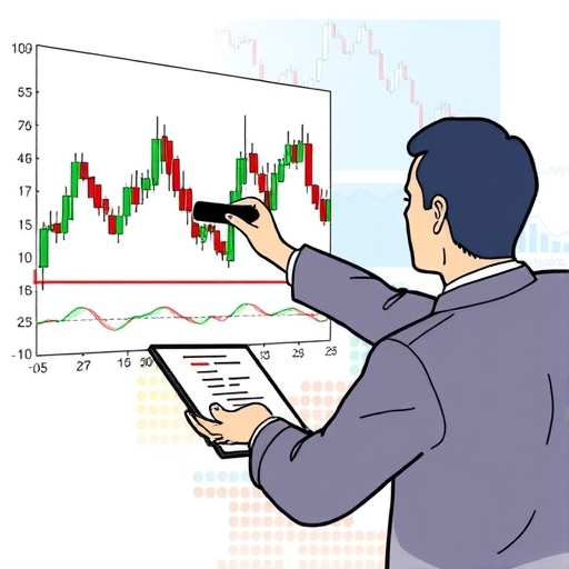
Technical analysis, or TA, is the study of historical price and volume data to predict future market movements. Instead of dissecting balance sheets or unemployment reports, technical analysts pore over charts, looking for patterns, trends, and signals. Think of it as learning the language of the market itself, spoken through the universal dialect of supply and demand reflected in price action.
Why is this skill crucial for you as an investor or trader? Because price action often anticipates fundamental shifts. Market sentiment, fear, and greed are quickly reflected in how buyers and sellers interact, often before the underlying fundamental changes become widely known or reported. By understanding TA, you gain a framework for making timely decisions based on how the market is *behaving*, not just what the news is saying.
However, it’s essential to set realistic expectations from the start. Technical analysis is a powerful tool, but it is not a crystal ball. It provides probabilities, not certainties. Markets can be irrational, and unforeseen events can always disrupt even the most perfect chart pattern. Our goal is to equip you with the knowledge and skills to interpret charts effectively, develop your own trading strategies, and manage risk intelligently. We will explore the foundational principles, common tools, and practical applications of technical analysis, moving from the basics to more sophisticated concepts. Are you ready to begin decoding the market’s message?

The Cornerstone Principles: What Technical Analysis Stands Upon
Before we dive into specific charts and indicators, let’s first understand the bedrock principles upon which all technical analysis is built. These tenets, largely derived from the pioneering work of Charles Dow in the late 19th century, provide the philosophical foundation for believing that studying price history can offer valuable insights into future price direction. Understanding these core ideas is like understanding the rules of gravity before trying to build a bridge; they govern how the system fundamentally operates.
The first and arguably most important principle is that market action discounts everything. This means that at any given moment, the current price of an asset reflects all available information relevant to that asset. This includes economic factors, political events, company performance, industry news, and even the collective psychology of all market participants. All known and anticipated factors are supposedly “priced in.” Therefore, if everything is already reflected in the price, studying the price itself is the most direct way to understand the market’s current state and potential future path.
The second principle is that price moves in trends. Markets rarely move in a straight line, but rather fluctuate in discernible directions over various timeframes. These trends can be upward (bullish), downward (bearish), or sideways (ranging). Identifying the prevailing trend is perhaps the most fundamental objective of technical analysis, as trading with the trend (following the path of least resistance) is generally considered more profitable and less risky than trading against it. Trends exist at multiple levels – primary (long-term), secondary (medium-term), and minor (short-term) – and understanding their relationships is key to interpreting market structure.
The third principle is that history repeats itself. This tenet is rooted in market psychology. Human emotions like fear, greed, optimism, and pessimism have always driven market participants, and these emotions tend to lead to predictable reactions to similar market stimuli over time. Chart patterns that appeared decades ago often reappear today because the underlying human behavior that created them remains consistent. Technical analysts study these recurring patterns – in price action, volume, and indicator readings – believing that if a certain pattern led to a specific outcome in the past, it has a higher probability of leading to a similar outcome in the future. This focus on repeating psychological dynamics makes understanding chart patterns and market structure so powerful.
These three principles underpin the entire discipline. By accepting that price reflects all information, that prices move in trends, and that market psychology is repetitive, you can begin to see why analyzing charts is a valid and often effective approach to market forecasting and trading.
| Principle | Description |
|---|---|
| Market action discounts everything | The current price reflects all available information. |
| Price moves in trends | Prices tend to fluctuate in recognizable directions. |
| History repeats itself | Market psychology leads to predictable reactions. |
Your Visual Toolkit: Understanding Chart Types and Candlestick Psychology
Charts are the primary tools of the technical analyst. They transform raw price data into visual representations that make trends and patterns discernible. Just as an architect uses blueprints or a sailor uses maps, a trader uses charts to navigate the market landscape. While there are several ways to visualize price data, three types are most common: line charts, bar charts, and candlestick charts.
Line charts are the simplest, connecting a series of closing prices over a given period. They are useful for providing a clear, uncluttered view of the overall trend, especially over longer timeframes, by filtering out the noise of intraday fluctuations. However, they offer limited detail, showing only the closing price and nothing about the price action within the period.
Bar charts provide more detail. Each vertical bar represents a specific time period (e.g., one day, one hour). The top of the bar indicates the highest price reached during that period, the bottom indicates the lowest price, a small horizontal hash mark on the left side shows the opening price, and a hash mark on the right side shows the closing price. This “OHLC” data (Open, High, Low, Close) offers a fuller picture of the price range and where the price finished within that range.
Candlestick charts are arguably the most popular among modern traders, and for good reason. Originating in Japan centuries ago to track rice prices, they offer the same OHLC data as bar charts but in a more visually intuitive format that quickly conveys market sentiment. Each candlestick represents a time period. It has a “body” and “wicks” (or “shadows”). The body represents the range between the opening and closing prices. If the closing price is higher than the opening price, the body is typically colored green or white, indicating a bullish period. If the closing price is lower than the opening price, the body is typically colored red or black, indicating a bearish period. The wicks extend above and below the body, showing the highest (upper wick) and lowest (lower wick) prices reached during the period.
The power of candlesticks lies in their ability to tell a story about the battle between buyers and sellers within a single period. A long green body with short wicks suggests strong buying pressure dominating the entire period. A long red body suggests strong selling pressure. A small body (like a Doji) with long wicks suggests indecision; buyers pushed price up, sellers pushed it down, and it closed near where it opened. A Marubozu is a candle with no wicks, indicating extreme conviction (price moved straight up or down from open to close). A Hammer (long lower wick, small body near the top) or an Inverted Hammer (long upper wick, small body near the bottom), especially after a trend, can signal potential reversals as price attempted to move but was pushed back.
By learning to read individual candlesticks and common candlestick patterns (combinations of two or more candles, like the Bullish Engulfing or Bearish Harami), you gain valuable insights into shifts in momentum and potential turning points even before larger trends become obvious. This psychological insight encoded in each candle is what makes them such a favoured tool.
| Candlestick Pattern | Description |
|---|---|
| Doji | Indicates indecision in market direction. |
| Marubozu | Shows strong conviction in price movement. |
| Hammer | Signals potential reversal after a downtrend. |
Navigating the Price Map: Identifying Support and Resistance Levels
Imagine price as a journey across a landscape. On this journey, price often encounters levels where it seems to pause, consolidate, or even reverse direction. These levels are known as Support and Resistance. Think of support as a floor where falling prices tend to stop and bounce back up, and resistance as a ceiling where rising prices tend to stop and fall back down. Identifying these key levels is fundamental to technical analysis, providing potential entry and exit points for trades and helping to define risk.
Support is a price level where buying interest is expected to be strong enough to overcome selling pressure, causing the price decline to stall and potentially reverse upwards. Why does this happen? Often, it’s a level where previous price action showed a strong bounce, or where a large number of buyers previously entered the market, creating a psychological anchor. As price approaches this level again, these buyers might look to add to their positions, or others who missed the initial move might see it as a favorable entry point, collectively increasing demand.
Resistance, conversely, is a price level where selling interest is expected to be strong enough to overcome buying pressure, causing the price advance to stall and potentially reverse downwards. This might be a level where sellers previously dominated, or where buyers who bought at lower prices might look to take profits. As price approaches this level, sellers might become more aggressive, or existing buyers might exit their positions, collectively increasing supply.
These levels matter because they represent potential battlegrounds between buyers and sellers. A breach of a strong support or resistance level often signals a significant shift in sentiment and can lead to accelerated price movement in the direction of the break. What’s particularly interesting is that once a support level is significantly broken, it often turns into a new resistance level, and vice versa. This phenomenon, known as support turning into resistance (and resistance into support), is a crucial concept in understanding market structure.
How do you identify these levels on a chart? They are often found at previous swing highs (peaks) and swing lows (troughs). Horizontal lines drawn through these significant turning points are the most common way to visually mark static support and resistance. However, S/R can also be dynamic, represented by trend lines, moving averages, or Fibonacci levels, which change as price moves. The more times a price level has acted as S/R, and the stronger the price reaction was at that level, the more significant that level is considered to be. Learning to spot and draw these levels effectively is like getting your bearings on a map; they show you the potential hurdles and pathways ahead.
| Level | Description |
|---|---|
| Support | Price level where buying interest overcomes selling pressure. |
| Resistance | Price level where selling interest overcomes buying pressure. |
Riding the Wave: Understanding and Drawing Trend Lines and Channels
As we discussed, the second principle of technical analysis is that price moves in trends. Identifying and trading with the prevailing trend is a cornerstone strategy for many traders. Just as a surfer waits for the right wave, a trend-following trader waits for a clear trend to emerge before riding it. Trend lines and channels are graphical tools that help us identify, visualize, and follow these directional movements.
A trend line is a straight line drawn on a chart connecting a series of significant price points, either highs or lows, to represent the direction and slope of the trend. For an uptrend (prices generally moving higher), we draw an upward-sloping line connecting two or more successive higher lows. This line acts as dynamic support; as price pulls back, it is expected to find support along the trend line before continuing its upward journey.
For a downtrend (prices generally moving lower), we draw a downward-sloping line connecting two or more successive lower highs. This line acts as dynamic resistance; as price attempts to rally, it is expected to find resistance along the trend line before continuing its downward movement.
Drawing valid trend lines requires practice. The general rule is that a trend line should touch at least two significant price points. The more points it touches, and the longer the line holds, the stronger the trend line is considered to be. A steeper trend line indicates a stronger, potentially less sustainable, trend, while a flatter line suggests a weaker or more gradual trend.
A trend channel takes this concept a step further. Once you have drawn a valid trend line, you can draw a parallel line equidistant from the trend line, connecting the swing highs in an uptrend or the swing lows in a downtrend. This creates a channel within which price is expected to fluctuate. The main trend line (connecting lows in an uptrend, highs in a downtrend) is often called the “support line” or “resistance line” of the channel, while the parallel line is called the “return line” or “channel line.” Price swings between these two parallel lines, respecting both the main trend line and the return line.
Trend lines and channels provide valuable information. They help confirm the existence and direction of a trend, offer dynamic support and resistance levels, and can even be used to set price targets (e.g., expecting price to move towards the return line). What happens when price breaks decisively through a trend line or channel boundary? A break below an uptrend line or above a downtrend line often signals that the trend may be weakening or reversing. Monitoring these breaks, ideally confirmed by increased volume or other indicators, is crucial for identifying potential shifts in market direction.
Beyond Price Action: Introducing Technical Indicators
While price action (the raw movement displayed on the chart) and chart patterns are the foundation of technical analysis, many traders use technical indicators to gain additional insights, confirm signals, or generate trade ideas. Technical indicators are mathematical calculations based on historical price, volume, or other data, plotted on the chart or in separate windows below the price pane. They help quantify market conditions and can provide different perspectives than simply looking at price bars or candles.
Why use indicators? They can help to:
- Confirm the strength or weakness of a trend.
- Identify potential trend reversals or continuations.
- Determine if an asset is overbought or oversold.
- Measure the momentum of price movements.
- Generate specific buy or sell signals based on predefined rules.
It’s important to understand that indicators are derivative; they are calculated from price (and sometimes volume). They do not predict the future with certainty but help interpret the data the market has already generated. Think of price as the primary signal and indicators as secondary tools to help clarify that signal, much like a navigator uses a compass or an altimeter in addition to a map.
Indicators can generally be categorized based on what they measure or how they behave:
- Trend-Following Indicators: These help identify and confirm the direction of a trend. They tend to be lagging indicators, meaning they signal after a trend is already underway. Examples include Moving Averages and MACD.
- Oscillators: These indicators fluctuate between set values or around a centerline. They are often used to identify momentum, overbought/oversold conditions, and potential turning points in ranging markets. Examples include RSI, Stochastic Oscillator, and CCI. Oscillators can sometimes provide leading signals, indicating potential price shifts before they occur on the chart, particularly through divergence.
- Volume Indicators: These incorporate trading volume data to confirm the strength of price movements or potential reversals.
A common pitfall for beginner traders is using too many indicators at once. This can lead to conflicting signals, chart clutter, and analysis paralysis. A better approach is to understand a few key indicators thoroughly, how they work, and in which market conditions they are most reliable. Use them to complement your price action analysis, not replace it entirely. In the next sections, we will delve into some of the most popular and widely used technical indicators.
Key Trend-Following Indicators: Moving Averages and MACD Explained
Trend-following indicators are designed to help you identify and ride the prevailing market trend. They work by smoothing out price data to make the trend more visible and provide signals based on changes in the average price over time. Two of the most foundational trend-following indicators are Moving Averages and the Moving Average Convergence Divergence (MACD).
Moving Averages (MAs) are simply the average price of an asset over a specific period, plotted as a single line on the chart. As each new period closes, the oldest data point is dropped, and the newest is added, causing the average (and thus the line) to “move.” The most common types are:
- Simple Moving Average (SMA): A simple average of prices over the specified period. Each price point within the period has equal weight.
- Exponential Moving Average (EMA): A weighted average that gives more weight to recent prices, making it more responsive to new information than an SMA.
Moving Averages are used in several ways:
- Identifying Trend Direction: A rising MA suggests an uptrend, while a falling MA suggests a downtrend. The slope of the MA indicates the strength of the trend.
- Dynamic Support and Resistance: MAs often act as dynamic support (in an uptrend) or resistance (in a downtrend). Price may pull back to a significant MA (like the 50-period or 200-period MA) and bounce.
- Crossover Signals: Signals can be generated when price crosses above/below an MA, or when a shorter-period MA crosses a longer-period MA (e.g., a bullish signal when the 50-period MA crosses above the 200-period MA).
The choice of MA period depends on the trading timeframe. Shorter periods (e.g., 10, 20) are more sensitive and used for short-term trends, while longer periods (e.g., 50, 100, 200) are used for longer-term trends and major S/R levels.
The Moving Average Convergence Divergence (MACD) is a more complex but highly popular trend-following and momentum indicator developed by Gerald Appel. It measures the relationship between two EMAs. The standard MACD is calculated by subtracting the 26-period EMA from the 12-period EMA. This result is the MACD line. A 9-period EMA of the MACD line is then plotted as the signal line. A histogram is also often plotted, showing the difference between the MACD line and the signal line.
MACD signals are typically interpreted as follows:
- Crossovers: A bullish signal occurs when the MACD line crosses above the signal line. A bearish signal occurs when the MACD line crosses below the signal line.
- Zero Line Crossovers: The MACD line crossing above the zero line can confirm a bullish trend, and crossing below can confirm a bearish trend.
- Divergence: This is a powerful signal. Bullish divergence occurs when price makes a lower low, but the MACD makes a higher low. Bearish divergence occurs when price makes a higher high, but the MACD makes a lower high. Divergence suggests that the current trend’s momentum is weakening and a reversal might be imminent.
MACD is versatile and can be used to identify trend direction, momentum, and potential reversals. Like MAs, the periods used can be adjusted, but the standard 12, 26, 9 settings are widely used and understood.
| Indicator | Description |
|---|---|
| Simple Moving Average (SMA) | Averages prices over a specified period. |
| Exponential Moving Average (EMA) | A weighted average that reacts more quickly to price changes. |
| MACD | Measures the relationship between two EMAs for trend-following. |
Key Oscillators: RSI and Stochastic for Momentum and Overbought/Oversold Signals
Oscillators are another critical type of technical indicator, particularly useful for identifying the strength of momentum and spotting potential turning points when prices have moved too far, too fast. Unlike trend-following indicators that lag price, oscillators can sometimes offer early signals of impending reversals, especially through divergence. Let’s look at two of the most popular: the Relative Strength Index (RSI) and the Stochastic Oscillator.
The Relative Strength Index (RSI), developed by J. Welles Wilder Jr., is a momentum oscillator that measures the speed and change of price movements. It oscillates between 0 and 100. The standard setting uses 14 periods (e.g., 14 days on a daily chart). The core calculation involves comparing the average gains over the period to the average losses.
RSI is typically used to identify overbought and oversold conditions:
- An RSI reading above 70 is generally considered overbought, suggesting that the price may have risen too quickly and could be due for a pullback or consolidation.
- An RSI reading below 30 is generally considered oversold, suggesting that the price may have fallen too quickly and could be due for a bounce or rally.
These levels (70 and 30) are not strict buy/sell signals on their own, as prices can remain overbought or oversold for extended periods in strong trends. However, they alert you to potential exhaustion in the current move.
One of the most powerful signals from the RSI is divergence. Bullish divergence occurs when price makes a lower low, but RSI makes a higher low, suggesting weakening bearish momentum. Bearish divergence occurs when price makes a higher high, but RSI makes a lower high, suggesting weakening bullish momentum. Divergence signals can be reliable indicators of potential trend reversals, especially when they occur at key support or resistance levels.
The Stochastic Oscillator, developed by George Lane, is another momentum indicator that compares a security’s closing price to its price range over a specific period. The underlying idea is that in an uptrend, prices tend to close near their highs, and in a downtrend, prices tend to close near their lows.
The Stochastic Oscillator is typically plotted with two lines:
- %K Line: The main line, reflecting the current closing price relative to the high/low range over the lookback period (standard is 14 periods).
- %D Line: A 3-period Simple Moving Average of the %K line, acting as a signal line.
The Stochastic Oscillator also oscillates between 0 and 100, and like RSI, is used to identify overbought and oversold conditions. The traditional levels are 80 (overbought) and 20 (oversold).
Signals from the Stochastic Oscillator include:
- Crossovers: A bullish signal occurs when the %K line crosses above the %D line, especially when both are below 20 (oversold territory). A bearish signal occurs when the %K line crosses below the %D line, especially when both are above 80 (overbought territory).
- Overbought/Oversold Readings: Readings above 80 or below 20 alert you to potential exhaustion.
- Divergence: Similar to RSI, divergence between price and the Stochastic lines can signal potential reversals.
While both RSI and Stochastic measure momentum, they do so slightly differently. RSI measures the *speed* of price changes, while Stochastic measures the *closing price’s location* within the recent range. Many traders use both, looking for confirmation, while others prefer one over the other depending on their trading style and the market being analyzed.
Adding Depth: Volume Analysis and Fibonacci Tools
While price charts are central, other dimensions of market data can provide powerful confirmation and insights. Volume, the amount of an asset traded during a specific period, is one such dimension. Tools based on sequences found in nature, like Fibonacci numbers, offer another layer of analysis by identifying potential price levels where market psychology might lead to reactions. Incorporating these elements adds depth to your technical analysis.
Volume Analysis is often considered the truth serum of the market. Price might fluctuate based on noise, but volume tells you about the conviction behind the move.
- Confirming Trends: In a healthy uptrend, price increases should be accompanied by increasing volume, and pullbacks on decreasing volume. This shows strong buying conviction. In a healthy downtrend, price decreases should see increasing volume, and rallies on decreasing volume, indicating strong selling conviction.
- Spotting Divergence: If price is making new highs but volume is decreasing, it suggests that buying pressure is waning, potentially signaling a reversal. If price is making new lows but volume is decreasing, it suggests selling pressure is weakening.
- Validating Breakouts: A breakout from a support or resistance level or a chart pattern is considered more reliable if it occurs on significantly higher volume than average. Low volume breakouts can be false signals (head fakes).
Volume can be displayed as a histogram below the price chart. Analyzing volume alongside price action and indicators provides crucial context. A strong price move without corresponding volume is often suspect.
Fibonacci sequences are a series of numbers where each number is the sum of the two preceding ones (0, 1, 1, 2, 3, 5, 8, 13, 21, etc.). Ratios derived from these numbers (e.g., 0.618, 0.382, 0.5, 0.786) are observed remarkably often in natural phenomena and, curiously, in financial market movements. In technical analysis, the most commonly used tools are Fibonacci Retracements and Fibonacci Extensions.
Fibonacci Retracements are used to identify potential support or resistance levels during a price pullback within a trend. You draw a line between a significant swing low and a significant swing high (in an uptrend) or a swing high and a swing low (in a downtrend). Horizontal lines are then plotted at the key Fibonacci levels (23.6%, 38.2%, 50%, 61.8%, 78.6%) between these two points. These levels are expected to act as potential areas where price might pause, find support, and resume the trend (in a pullback), or find resistance and reverse (in a rally against the trend).
The 50% level, while not strictly a Fibonacci number, is often included because pullbacks to the halfway point are common in market corrections.
Fibonacci Extensions (or projections) are used to identify potential price targets beyond the initial trend move. They are drawn using three points: a swing low, a swing high (in an uptrend), and the end of the subsequent pullback. Key extension levels (100%, 161.8%, 200%, 261.8%) project potential points where the trending move might reach resistance or find targets.
Fibonacci tools work best when used in conjunction with other technical analysis techniques. For example, finding a Fibonacci retracement level that coincides with a previous support/resistance level or a moving average can strengthen its significance. While their predictive power might seem almost mystical, their effectiveness is largely attributed to their widespread use, making them self-fulfilling prophecies as many traders watch and react to these same levels.
Building Your Strategy: Combining Tools and Developing a Trading Plan
Learning individual technical analysis tools – from chart patterns and S/R levels to indicators like MACD and RSI, volume, and Fibonacci – is like learning the alphabet and grammar of market language. The next crucial step is learning to string these elements together to form coherent sentences, paragraphs, and eventually, a complete story. This means combining multiple tools for confirmation and, most importantly, developing a systematic trading plan.
No single indicator or pattern is right 100% of the time. Relying on just one signal is a common pitfall. Instead, experienced traders use a combination of tools to build a higher-probability thesis about future price movement. This is known as confluence – when multiple independent signals align to suggest the same outcome.
For example, a potential bullish trade idea might emerge if:
- Price is in a clear uptrend (confirmed by a rising Moving Average).
- Price pulls back to a significant historical support level *and* a Fibonacci retracement level.
- A bullish candlestick pattern (like a Hammer or Engulfing pattern) forms at this support zone.
- An oscillator like RSI moves out of oversold territory and turns upwards.
- Volume increases as price starts to move up from the support zone.
Each of these signals on its own might not be compelling, but when they all occur simultaneously or in rapid succession at the same price level, they significantly increase the probability of a successful trade compared to relying on any single signal.
Combining tools isn’t about cluttering your chart with dozens of indicators. It’s about selecting a few complementary tools that you understand well and using them to build a case. You might combine a long-term trend filter (like a 200-period MA) with a shorter-term momentum indicator (like RSI) and confirmation from volume or candlestick patterns.
Once you understand how to identify potential trade opportunities using confluent signals, you need a trading plan. This is a documented, systematic approach that outlines precisely how you will trade. A robust trading plan typically includes:
- Your trading style/timeframe: Are you a swing trader, day trader, position trader? What timeframes will you analyze?
- Market selection: Which assets will you trade? (e.g., stocks, *forex pairs*, commodities).
- Entry Criteria: The exact conditions (based on your chosen TA tools) that must be met to enter a trade.
- Exit Criteria (Profit Target): How will you determine when to take profits? (e.g., reaching a resistance level, a specific risk/reward ratio, a crossover signal).
- Stop-Loss Strategy: Where will you place your stop-loss order to limit potential losses if the trade goes against you? (e.g., below a support level, a specific percentage below entry).
- Position Sizing: How much capital will you risk on each trade? (Based on your stop-loss distance and total account risk tolerance).
- Risk Management Rules: Maximum risk per trade, maximum daily/weekly drawdown.
- Trading Journal Plan: How will you record and review your trades?
Developing and strictly following a trading plan is crucial. It removes emotion from decision-making and ensures consistency. You should backtest your proposed strategy on historical data to see how it would have performed, and then forward test it (trading with real money or a demo account) to see how it performs in live market conditions before committing significant capital. This systematic approach is the bridge from learning TA concepts to becoming a profitable trader.
Mastering the Markets: Applying Technical Analysis Across Different Assets, Including Forex
One of the great strengths of technical analysis is its versatility. Because it focuses on the universal principles of supply and demand as reflected in price action, the tools and concepts we’ve discussed can be applied to virtually any market where price data is available. Whether you’re trading stocks, commodities, cryptocurrencies, or navigating the vast and liquid world of *forex* (foreign exchange) and CFDs (Contracts for Difference), technical analysis provides a common language.
The fundamental principles of trends, support/resistance, chart patterns, and indicators like MAs, MACD, and RSI apply universally. However, each market has its own characteristics that require traders to adapt their approach:
Stocks: Often influenced by company fundamentals and news, but technical patterns are widely observed and traded. Volume data is particularly important here as it reflects institutional participation.
Commodities: Influenced by global supply/demand, weather, and geopolitical events. Technical analysis is essential for identifying trends and key price levels in volatile markets like oil or gold.
Cryptocurrencies: Known for high volatility and 24/7 trading. Technical analysis is extremely popular because fundamental analysis is often less clear-cut. Watch out for lower volume on smaller coins and potential manipulation. Due to 24/7 nature, candlestick patterns and indicators might behave slightly differently than in markets with defined trading hours.
Forex and CFDs: These markets present unique characteristics. Forex trading occurs 24 hours a day, five days a week, offering constant opportunities but also requiring vigilance. The high leverage available in *forex* and CFD trading magnifies both potential profits and losses, making rigorous risk management, guided by technical analysis for stop-loss placement, absolutely critical.
Applying technical analysis to *forex* trading involves studying currency pair charts (e.g., EUR/USD, GBP/JPY) using the same indicators and patterns. You might look for trends on a 4-hour chart, identify S/R levels on a 1-hour chart, and use candlestick patterns on a 15-minute chart for entry signals. The key is consistency in applying your chosen methodology across the specific pairs you trade. When you’re ready to apply your technical analysis insights to live trading, choosing the right platform is paramount.
If you’re considering diving into *forex trading* or exploring more CFD instruments, then Moneta Markets is a platform worth considering. Hailing from Australia, it boasts over 1000 financial instruments, catering to both beginners and experienced traders alike.
Effective application of TA in *forex* and CFD markets relies heavily on your trading platform’s capabilities. You need access to charting tools, indicators, and the ability to execute trades rapidly at favourable prices. Features like low spreads (the difference between buy and sell prices) are particularly important in high-frequency or short-term *forex* trading strategies based on tight TA signals.
When selecting a trading platform, Moneta Markets‘ flexibility and technological advantages are worth noting. It supports popular platforms like MT4, MT5, and Pro Trader, combining high-speed execution with competitive low spread settings, providing a solid trading experience for implementing your technical analysis strategies.
Whether you’re focusing on stocks, commodities, or actively trading *forex* based on technical signals, the core skills of reading charts, identifying trends, and interpreting indicators remain the same. The market specifics primarily influence which timeframes and particular patterns might be more prevalent or reliable, and the importance of choosing a broker that facilitates your trading style.
The Trader’s Mindset: Psychology, Discipline, and Continuous Learning
Technical analysis provides the tools to identify potential trading opportunities, but the execution and ultimate success depend heavily on the trader’s psychology and discipline. Markets are driven by human emotion, and while TA patterns reflect collective sentiment, individual traders must manage their own emotional responses to succeed. Mastering your mindset is just as important as mastering chart patterns.
Emotion is perhaps the biggest enemy of a trader. Fear can cause you to miss opportunities or exit profitable trades too early. Greed can lead you to take excessive risks, hold losing trades for too long hoping they’ll turn around, or chase trades that don’t fit your plan. Hope can keep you anchored to a losing position. Learning to recognize and control these emotions is vital.
This is where discipline becomes paramount. A well-defined trading plan, as discussed earlier, is your roadmap. Discipline is the ability to stick to that plan, even when emotions are telling you to do otherwise. This means:
- Only taking trades that meet your exact entry criteria.
- Always placing your stop-loss orders as planned to limit potential losses.
- Taking profits according to your exit strategy, even if you think the price could go further.
- Avoiding impulsive decisions based on news headlines or forum chatter.
- Not engaging in “revenge trading” after a loss.
Why is sticking to the plan so hard? Because trading involves uncertainty and losses are part of the game. It’s easy to follow the plan when you’re winning, but challenging when you’re facing a string of losses. This is where risk management, a key component of your trading plan, protects you. By risking only a small percentage of your capital on each trade (e.g., 1-2%), a single loss or even several losses in a row will not cripple your account. This knowledge helps reduce the fear associated with trading.
Common psychological biases also trip up traders. Confirmation bias leads you to only seek out information that supports your existing trade idea. Recency bias gives too much weight to recent market events, making you ignore the bigger picture. Overconfidence after a winning streak can lead to reckless trading. Keeping a detailed trading journal is an excellent way to combat these biases and improve discipline. Record every trade, including your reasoning, your entry/exit points, your emotions, and the outcome. Regularly review your journal to identify patterns in your decision-making, both good and bad.
Finally, the financial markets are constantly evolving. New technologies emerge, market dynamics shift, and what worked yesterday might not work tomorrow. Therefore, continuous learning is not optional for a technical analyst; it’s a necessity. Stay updated on new technical tools, refine your understanding of existing ones, analyze your performance honestly, and be willing to adapt your strategies. The pursuit of mastery in technical analysis, like any complex skill, is a lifelong journey of learning, practice, and self-improvement.
rfedFAQ
Q:What is technical analysis?
A:Technical analysis is the study of historical price and volume data to predict future market movements.
Q:How do I identify support and resistance levels?
A:Support and resistance levels can be identified at previous swing highs and lows by drawing horizontal lines through significant turning points.
Q:What is the purpose of using indicators in technical analysis?
A:Indicators help confirm signals, identify trends, assess momentum, and generate trade ideas based on historical data.