Mastering the Downward Trend Line: Your Compass in Bearish Markets
Welcome to this deep dive into one of the most fundamental and powerful tools in technical analysis: the trend line. As traders and investors, understanding the direction and strength of price movements is paramount. While upward trend lines signal bullish momentum, it’s the **downward trend line** that becomes your essential compass when navigating the often challenging terrain of a bearish market or correctional phase. This guide is designed to help you, whether you’re just starting out or looking to refine your strategy, interpret these critical lines and leverage their insights to make more informed decisions.
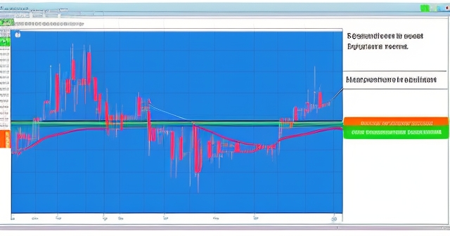
Think of trend lines as dynamic indicators drawn directly onto your price charts. They connect a series of price points, visually representing the prevailing direction of supply and demand forces. A **downward trend line** specifically connects successive lower highs, illustrating a consistent decline in the price where sellers are stepping in at progressively lower levels. This indicates that supply is currently outweighing demand, driving the price lower.
Why is mastering the **downward trend line** so crucial? Because it serves multiple vital functions. It clearly defines the bearish trend, acts as a dynamic level of resistance that price often struggles to overcome, and provides potential signals for both continuing bearishness and potential bullish reversals. By understanding how price interacts with this line, you can gain valuable insights into market sentiment and potential future movements across various assets, from stocks and commodities to cryptocurrencies and currency pairs like USDCAD.
- Trend lines visually represent the prevailing direction of supply and demand forces.
- A downward trend line connects successive lower highs, indicating a decline in price.
- Mastering downward trend lines helps define trends and identify potential trading signals.
| Function of Downward Trend Line | Description |
|---|---|
| Defines Bearish Trend | Identifies sustained decline in price. |
| Dynamic Resistance | Acts as a barrier preventing price increases. |
| Signals Reversals | Indicates potential bullish reversals after a breach. |
Defining the Downward Trend Line: Connecting the Dots of Selling Pressure
At its core, a **downward trend line** is a simple graphical representation, yet its implications are profound. To draw a valid **downward trend line**, you need at least two significant lower highs on a price chart. Ideally, you’ll find three or more points of contact, as each subsequent touch or test of the line strengthens its validity and significance. The line is drawn connecting these highs and extended into the future.
Consider the price action you observe on a chart. During a **downtrend**, prices make lower highs and lower lows. The **downward trend line** specifically focuses on those lower highs. Each time the price rallies but fails to surpass the previously established lower high and instead reverses back down, it confirms the presence of selling pressure at that level. By drawing a line through these points, you are visually capturing the upper boundary of this selling pressure.

This line isn’t merely an arbitrary drawing; it represents a zone where traders who missed selling at previous highs or those initiating short positions see value in selling again. It’s a psychological and technical barrier. As long as the price remains below this line, the **bearish trend** is considered intact, and the path of least resistance is likely downwards. The steeper the slope of the **downward trend line**, the stronger and more aggressive the **bearish momentum**.
Understanding how to accurately draw and interpret this line is foundational. It’s the first step in using this powerful tool effectively. We look for clear reaction highs, points where the rally failed and the price turned lower. Connecting these points gives us the **downward trend line**, a key indicator of the prevailing **selling pressure** and the dynamic **resistance** level overhead.
Downward Trend Lines as Dynamic Resistance: When Supply Reigns
One of the primary functions of a **downward trend line** is to act as a dynamic level of **resistance**. Unlike static horizontal support and resistance levels, a trend line’s value changes over time, sloping downwards along with the price action. When the price rallies up to meet the **downward trend line**, it is often met with renewed **selling pressure**, causing the price to reverse and continue its **downtrend**. This interaction reinforces the validity of the trend line and confirms the dominance of **supply** over **demand** in the market.
We see this play out in charts regularly. Take the example of Docusign (DOCU) or Enphase Energy (ENPH) during certain bearish phases. Their price action often respects a well-defined **downward trend line**, with rallies consistently stalling upon reaching it. This suggests that sellers are active at or near this line, preventing the price from making significant upward progress. Trading alongside or below a **downward trend line** thus becomes a strong indicator of prevailing **bearish conditions**.
When the price attempts to break above the **downward trend line** but fails – often referred to as a ‘test’ or ‘bump’ – it further strengthens the line’s significance as resistance. This failure to break through confirms that the **selling pressure** at that level is still strong. Such tests, especially when they occur after a period of price approaching the line, can be interpreted by traders as confirmation that the **downtrend** is likely to continue.
The more times the price touches and respects a **downward trend line**, the more established and reliable that line becomes as a **resistance** level. It signals to market participants that this is a level where **supply** is readily available, making it a key point of reference for traders. Recognizing this dynamic resistance is crucial for identifying potential shorting opportunities or avoiding long positions prematurely during a **bearish trend**.
Confirming the Bearish Outlook: Combining Downward Trend Lines with Other Indicators
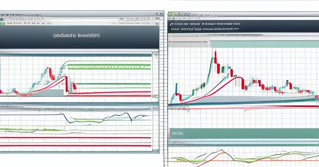
While a **downward trend line** is a powerful tool on its own, its signals are significantly strengthened when confirmed by other technical indicators. Technical analysis is most effective when different tools converge to tell the same story. When a **downward trend line** coincides with other forms of **resistance**, such as a key moving average like the 50-day SMA (Simple Moving Average) or previous horizontal **support** that has now turned into **resistance**, the **bearish outlook** is reinforced.
Consider the case of Blackrock (BLK). If its price is trading below a **downward trend line**, and a rally pushes it up to test this line, that signal becomes even more potent if the 50-day SMA is located at or near the same price level. This creates a confluence of **resistance**, making it a much more significant hurdle for the price to overcome. If the price is rejected from this combined resistance area, it strongly suggests that the **bearish momentum** is likely to persist.
Oscillators like the Stochastic and RSI (Relative Strength Index) can also provide valuable confirmation. If a price rally up to a **downward trend line** is accompanied by the Stochastic or RSI reaching overbought levels, it adds weight to the expectation that the price will reverse downwards. Similarly, **negative divergence** between the price (making a higher high or failing to make a lower low) and an oscillator (making a lower high) near a **downward trend line** can signal weakening upward momentum and potential rejection from the line.
By using multiple indicators in conjunction with your **downward trend line**, you are building a more robust case for your analysis. It helps filter out false signals and increases the probability of identifying genuine opportunities. This integrated approach, combining visual tools like trend lines with mathematical indicators, is a hallmark of experienced technical analysis and helps you gain conviction in your **price forecasts** and **trading strategies**.
The Bullish Counter-Signal: The Significance of a Downward Trend Line Breakout
While a **downward trend line** typically signifies **bearish conditions**, its breach or breakout can be one of the most important **bullish signals** in technical analysis. When the price decisively breaks above a well-established **downward trend line**, it suggests that the **selling pressure** that defined the **downtrend** is weakening or has potentially reversed. This can mark the beginning of a shift in **market conditions**, potentially leading to an upward price movement or even a complete trend reversal.
Think about what a breakout represents: buyers have finally gained enough strength to push the price above the level where sellers were previously dominant. This suggests that **demand** is now starting to outweigh **supply**. A confirmed breakout is often seen as a signal that the path of least resistance has shifted from downwards to potentially upwards.
Look at the example of Nu Holdings (NU). A confirmed breach above its main **downward trend line** in the medium term could be interpreted as a signal of potential bullish reversal. This doesn’t guarantee an immediate straight line up, but it suggests a significant change in the underlying dynamics that were driving the price down. Traders often look for follow-through price action after a breakout to confirm its validity, such as the price staying above the broken trend line or breaking above subsequent **resistance** levels.
A **breakout** from a **downward trend line** is often accompanied by an increase in trading volume, which further validates the move. Higher volume suggests that there is strong conviction behind the buying pressure that drove the price above the line. Traders may look to enter long positions upon a confirmed breakout, often placing their stop-loss orders below the newly broken trend line (which can now act as **support**) or below a recent swing low to manage risk.
| Breakout Features | Implication |
|---|---|
| Decisive Break Above | Indicates weakening selling pressure. |
| Increased Trading Volume | Confirms conviction behind buying. |
| Follow-through Action | Validates the breakout signal. |
Successfully breaking through a significant **downward trend line** is a powerful technical event. It’s a visual cue that the balance of power between buyers and sellers may be shifting. While false breakouts can occur, recognizing and acting on valid breakouts is a key skill for identifying potential **bullish opportunities** as the market transitions out of a **downtrend**.
If you’re exploring trading opportunities, especially in volatile markets like forex or cryptocurrencies, understanding these breakout patterns is crucial. They can signal significant shifts. When choosing a platform to execute trades based on such analysis, you’ll want one that offers robust charting tools and fast execution. If you’re considering starting or enhancing your forex trading journey or exploring various CFD products, Moneta Markets is a platform worth considering. Based in Australia, it offers over 1000 financial instruments, suitable for both beginners and experienced traders.
Timeframes and Subjectivity: Drawing and Interpreting Trend Lines Across Scales
One important aspect of **downward trend line** analysis is its application across different timeframes. A **downward trend line** drawn on an intraday chart (like 15-minute or 1-hour) provides insights into short-term price action and momentum. A line drawn on a daily or weekly chart reflects the medium-term or long-term **bearish trend**. Traders often use trend lines on multiple timeframes to gain a comprehensive view of the **market conditions**.
- Intraday charts reflect short-term momentum and actions.
- Daily or weekly charts capture medium to long-term bearish trends.
- Using multiple timeframes enhances market condition insights.
For instance, a stock might be in a long-term **downtrend** defined by a **downward trend line** on the weekly chart, but within that trend, it could experience short-term rallies that are contained by a different, steeper **downward trend line** on the daily chart. Understanding these nested trends helps in formulating **trading strategies** appropriate for your desired holding period.
However, it’s also crucial to acknowledge the element of subjectivity in drawing **downward trend lines**. Where exactly do you place the line? Do you connect the absolute highs, or the closing prices of the highs? Different traders might draw slightly different lines depending on their chosen price points (highs, closes, or even candle bodies). This subjectivity means that while trend lines are powerful, they require practice and judgment. The most reliable trend lines are typically those that have been tested multiple times and are acknowledged by a large number of market participants.
Furthermore, the effectiveness of a **downward trend line** can diminish over time or after multiple tests. A line that has been tested four or five times might be more significant than one tested only twice, but it also means that **selling pressure** at that level has been repeatedly absorbed. While more touches *can* strengthen the line, too many touches *without* a significant price reaction away from the line might indicate that the **pressure** is building towards a potential breakout.
Developing the skill to draw meaningful and reliable **downward trend lines** on charts requires practice. It involves identifying the most significant price highs that align well and demonstrate clear rejection points. Consistent application across different assets and timeframes will help you refine your approach and better interpret the signals these lines provide.
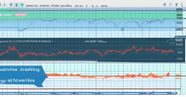
Long-Term Perspective: Regression Trend Lines and Deviation Analysis
Beyond the simple **downward trend line** connecting price peaks in a **downtrend**, there’s another related concept used in longer-term analysis: the regression trend line. While not solely focused on **downtrends**, this method provides a different perspective on the secular trend of an asset’s price. A linear regression trend line statistically calculates the best-fit line through a series of price data points over a specific period, often used for long-term analysis like the S&P Composite index.
The **regression trend line** represents the average price movement or growth rate over that long timeframe. Analyzing the **deviation** of the current price from this **regression trend line** can offer insights into whether the asset is currently trading above or below its historical trend. Significant **deviation** below the regression line might suggest that the asset is currently undervalued relative to its long-term growth path, potentially indicating a prolonged period of **underperformance** or a deep correction within a larger trend.
For example, analyses of the S&P Composite using long-term **regression trend lines** often show periods where the index trades significantly above or below the trend. When it trades far below, it suggests a substantial departure from its historical growth trajectory, often occurring during major bear markets or economic downturns. While different from drawing a **downward trend line** on a medium-term price chart, this regression analysis is another application of the concept of identifying a central price path and analyzing deviations from it.
Applications Across Asset Classes: From Stocks to Commodities and Cryptocurrencies
The power of **downward trend line** analysis lies in its universality. It is applicable across virtually all financial asset classes where price charting is used. Whether you are analyzing stocks like DOCU or ENPH, commodities like Brent Crude Oil, currency pairs like USDCAD, or cryptocurrencies like Bitcoin (BTCUSD) and Ethereum (ETHUSD), **downward trend lines** provide valuable visual insights into **selling pressure** and **resistance**.
- In stocks, a downward trend line indicates selling interest.
- In commodities, it reflects changes in demand or supply dynamics.
- In cryptocurrencies, it defines correction boundaries and potential bullish signals.
In the stock market, a prominent **downward trend line** on a stock’s chart during a period of decline signals strong institutional selling or lack of buying interest. A breakout could indicate a shift in sentiment or a company-specific positive development. For commodities, a **downward trend line** might reflect decreasing **demand** or increasing **supply** at a macro level, as seen in some **price forecasts** for Brent crude oil that highlight trading alongside a **downward trend line**.
In the volatile world of cryptocurrencies, where price swings can be dramatic, **downward trend lines** are just as relevant. They help define the boundaries of steep corrections. A break above a significant crypto **downward trend line** is often interpreted as a strong **bullish signal**, potentially preceding rapid upward movement, though confirmation from other indicators is always recommended.
Even in the forex market, charting currency pairs involves identifying trends using trend lines. A **downward trend line** on a USDCAD chart would indicate that the Canadian Dollar is strengthening relative to the US Dollar, driven by sustained selling of the pair. Recognizing these lines is crucial for identifying potential entry and exit points in **forex trading**.
The core principle remains the same regardless of the asset: the **downward trend line** shows where sellers are active and acts as a dynamic barrier to price increases. Its universal application makes it an indispensable tool in any trader’s arsenal, providing a consistent framework for analyzing **market conditions** and formulating asset-specific **trading strategies**.
When engaging in diverse asset trading like stocks, commodities, or forex, having a reliable platform is key. In choosing a trading platform, the flexibility and technical advantages of Moneta Markets are worth highlighting. It supports popular platforms like MT4, MT5, and Pro Trader, combining high-speed execution with competitive spreads to offer an excellent trading experience across various markets.
Practical Trading Applications: Entry, Exit, and Risk Management
Understanding **downward trend lines** isn’t just academic; it has direct practical applications in your **trading strategy**, particularly concerning entry, exit, and **risk management**. Trend lines help you identify potential trading opportunities based on the anticipated continuation of the **downtrend** or a potential reversal upon a breakout.
If you are trading with the **downtrend**, the **downward trend line** acts as a dynamic **resistance** level where you might look for potential short entry points. A price rally up to the line that shows signs of rejection (e.g., bearish candlestick patterns, negative oscillator signals) could signal a good opportunity to enter a short position, expecting the **downtrend** to continue. Your stop-loss order could be placed just above the **downward trend line** or the recent high to manage potential losses if the price unexpectedly breaks through.
Conversely, if you are looking for a potential trend reversal, a confirmed breakout above the **downward trend line** can be a signal for a long entry. As discussed earlier, this breakout suggests a potential shift in **market conditions**. Upon a convincing break and potential retest of the line (where the broken **resistance** now acts as **support**), you might consider entering a long position. In this case, your stop-loss would likely be placed below the broken trend line or a recent swing low.
| Application | Trading Strategy |
|---|---|
| Short Selling | Enter short near the downward trend line. |
| Long Entry | Confirm breakout for potential long entry. |
| Risk Management | Set stop-loss above broken trend line. |
**Downward trend lines** are also crucial for managing existing positions. If you are in a short position, the **downward trend line** confirms that the trend is still working in your favor. If the price rallies towards the line, you might consider tightening your stop-loss or taking partial profits as a precautionary measure against a potential breakout. If you are holding a long position during a market correction characterized by a **downward trend line**, the line acts as a clear signal that the **bearish pressure** is dominant, prompting you to re-evaluate your position and potentially exit if the price cannot break above it.
By providing clear visual boundaries for **resistance** and potential reversal points, **downward trend lines** help you define your trade setups, set appropriate stop-loss levels, and manage the inherent **risk** in trading. They bring structure to otherwise chaotic **price action** and help you make more disciplined decisions.
Potential Pitfalls and Nuances: Avoiding False Signals and Over-reliance
While incredibly useful, **downward trend line** analysis is not foolproof, and traders should be aware of potential pitfalls and nuances. One common issue is the occurrence of **false breakouts**. Price might briefly move above the **downward trend line**, suggesting a potential bullish reversal, only to quickly reverse back down below the line, trapping bullish traders. To mitigate this, it’s important to wait for confirmation of a breakout, such as a strong close above the line on the relevant timeframe or subsequent price action staying above the line.
Another challenge is the subjectivity in drawing the line itself, as mentioned earlier. Different valid drawing methods might exist, and it’s important to be consistent in your approach. Recognizing that trend lines can sometimes be breached slightly before a true reversal or that their slope might need adjustment as new price data emerges is part of the trading process.
Over-reliance on any single indicator, including **downward trend lines**, is another pitfall. Markets are complex systems influenced by numerous factors, not just technical patterns. While technical analysis provides valuable insights into **price action** and **market psychology**, it should ideally be used in conjunction with fundamental analysis, awareness of broader **market conditions**, and risk management principles. A strong **downward trend line** might be in place, but unexpected news or a major economic event could cause a sudden and forceful break.
- Be cautious of false breakouts that may mislead traders.
- Ensure consistency in drawing trend lines to maintain clarity.
- Use a combination of indicators to give a fuller market picture.
Trend lines can also lose their significance over time if the market transitions into a choppy or range-bound period. In consolidation phases, price might oscillate around previous trend lines, making them less reliable as indicators of future direction. It’s important to recognize when a trend line is no longer effectively guiding the price and to adapt your analysis accordingly.
Finally, remember that drawing a trend line on a past price chart is always easier than drawing one in real time as price develops. Flexibility and a willingness to redraw or adjust your lines as new highs form are crucial for effective **downward trend line** analysis in live trading scenarios.
The Sage’s Perspective: Long-Term Vision and Cyclical Trends
From a broader, more ‘sage-like’ perspective, **downward trend lines** are manifestations of larger **market cycles** and the ebb and flow of **supply** and **demand** over time. They represent periods where corrective forces or secular shifts result in asset depreciation. Understanding these periods within the context of long-term growth trajectories, as seen in **regression analysis** of indices like the S&P Composite, provides a deeper appreciation for market dynamics.
Long-term investors, while not actively trading short-term fluctuations based on every trend line test, can still use the concept. A significant **downtrend**, visually captured by a steep **downward trend line** on a weekly or monthly chart, might signal a period where value is potentially being created for long-term accumulation. Conversely, a prolonged period far above a **regression trend line** might suggest potential overvaluation and higher future **risk**. This aligns with the concept of **regression to the mean**, where prices tend to revert back towards their historical averages or trends over long periods.
The cyclical nature of markets means that **downtrends** and their associated **downward trend lines** are inevitable phases. They cleanse excesses from previous bullish periods and set the stage for future growth. For a knowledge-focused approach to investing and trading, understanding *why* these patterns form – the underlying **selling pressure**, shifts in fundamentals, or changes in sentiment – is as important as recognizing the pattern itself.
Our mission is to empower you with this understanding. By demystifying tools like the **downward trend line**, we aim to help you see beyond the noise of daily price movements and identify the underlying forces at play. Whether you’re navigating a short-term correction or assessing a long-term market cycle, the ability to correctly interpret **downward trend lines** is a key step towards mastering **technical analysis** and achieving more consistent results in your investment journey.
For those seeking a comprehensive platform to apply these technical analysis skills across a variety of markets, including forex, Moneta Markets offers a globally regulated environment. If you are looking for a forex broker with regulatory protection and global trading capabilities, Moneta Markets holds multi-country regulatory certifications such as FSCA, ASIC, and FSA. They also provide full support including segregated client funds, free VPS, and 24/7 Chinese customer service, making them a preferred choice for many traders.
Conclusion: Your Continued Journey with Downward Trend Lines
We’ve covered the essential aspects of the **downward trend line**, from its basic definition as a visual representation of **selling pressure** to its role as dynamic **resistance**, its confirmation by other indicators, the powerful signal of its **breakout**, its application across different timeframes and asset classes, and its practical use in **trading strategy** and **risk management**. We’ve also touched upon the importance of combining it with other tools and being mindful of its limitations.
Mastering the **downward trend line** is an ongoing process. It requires practice in drawing, patience in waiting for confirmation signals, and discipline in following your **trading plan**. Remember that technical analysis is a tool to help you assess probabilities, not certainties. By integrating **downward trend line** analysis into your approach, you gain a clearer picture of **market conditions** during **bearish trends** and are better equipped to identify potential turning points.
Continue to study charts, identify **downward trend lines** in different assets and timeframes, and observe how price interacts with them. Test your interpretations against other indicators. Over time, you will develop a keen eye for these patterns and build confidence in using them to inform your **trading decisions**. Whether you are looking for opportunities to trade with the trend or anticipate a potential reversal, the **downward trend line** is an invaluable ally.
Our goal is to provide you with the knowledge and tools to navigate the complexities of the financial markets successfully. The **downward trend line** is just one piece of the puzzle, but it is a fundamental one. By truly understanding its significance and applying it diligently, you take another significant step towards becoming a more skilled and profitable trader.
We encourage you to continue learning, experimenting, and refining your approach. The market is a dynamic environment, but with the right knowledge and tools, you can approach it with greater confidence and clarity. Keep honing your skills, stay disciplined, and may your analysis of **downward trend lines** guide you towards favorable outcomes.
downward trend lineFAQ
Q:What is a downward trend line?
A:A downward trend line is a line drawn on a price chart connecting successive lower highs, indicating a decline in the price of an asset.
Q:How do you draw a downward trend line?
A:To draw a downward trend line, identify at least two significant lower highs and connect them, extending the line into the future.
Q:What does it mean when the price breaks above the downward trend line?
A:When the price breaks above the downward trend line, it may indicate that selling pressure is weakening, which could signal a potential bullish reversal.